BACKGROUND
Pocket is a cross-platform bookmarking service that allows people to save web content (articles, videos, podcasts, etc.) for consumption in the future. As the product evolved, the company layered on additional features like offline access, text-to-speech, and its own content recommendation engine. Pocket has since been acquired by Mozilla. But I was brought in as a contractor to work on their mobile activation problem, alongside the design partners from GV (then called Google Ventures, one of Pocket's investors.)
PROBLEM
Activation sits somewhere between acquisition and retention, so it often ends up being neglected as a metric of success. However, Pocket had noticed that signups via their mobile apps were resulting in significantly lower engagement rates than signups on desktop browsers. This trend seemed counterintuitive given Pocket's emphasis on anytime-anywhere utility, so there was an obvious opportunity to improve this KPI. Pocket wanted to uncover the hidden causes, and come up with a solution to boost their retention rate for mobile signups.
DISCOVERY
Before we actually brought in the partners from Google Ventures, I wanted to better understand what we were up against. So I set up a quick study of Pocket's mobile apps (iPhone, iPad, and Android) by running a series of tests on Usertesting.com. I've used services like this as a fast, inexpensive, low-commitment method of getting feedback from people on a product or idea. In this case, I just wanted to watch some people engage with the app, hear what they had to say, and hopefully identify some of the issues they encountered as Pocket newbies.
Within the first minute, I saw a woman struggling because she was trying out the add via email feature (which is one that many people gravitate towards because it seems the most familiar and straightforward.) The woman thought it wasn't working, but in fact she was simply getting thrown off by the short delay that is inherent in sending an email (as well as the need to refresh her list.) Clearly, this was only a small piece of the larger problem, but these tests helped surface usability issues that were previously unknown.
IDEATION
With insights from the tests in mind, we kicked off the sprints by putting up a wall full of "How Might We..." statements on Post-It notes and identified which problems were most critical to address over the course of the sprints (via dot voting.) Using one or more of the selected statements, we began sketching solutions. I use the term 'solutions' loosely. We weren't coming up with flows or UIs yet, we were coming up with phrases and doodles that propose an experience. For example, pre-populate Pocket with sample content so people's first contact with the product is not an empty list.
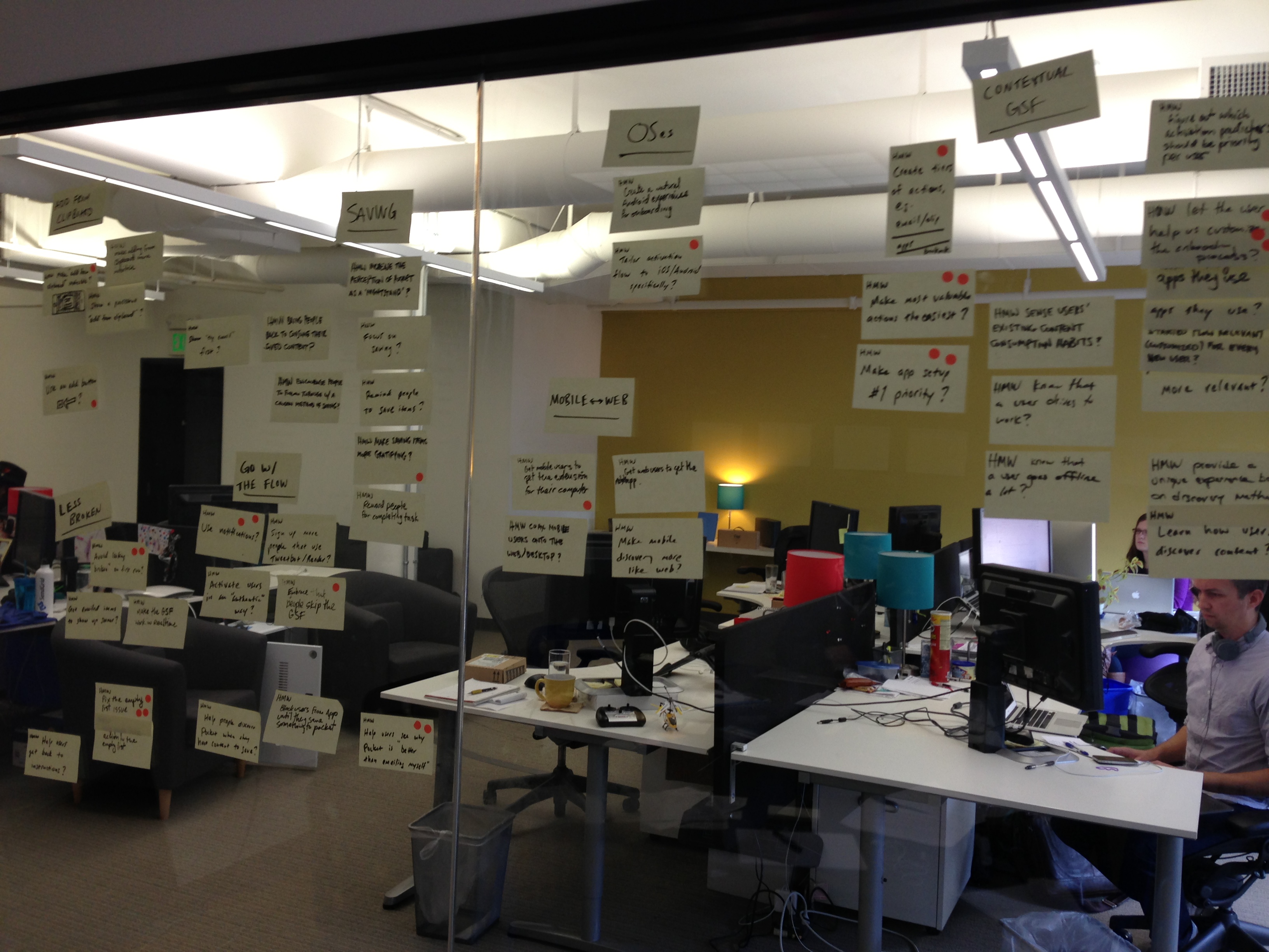
"How might we..." ideation
Another round of voting gave us a set of stories to tell with some rapid storyboarding. We're still not thinking about how these solutions might actually work in the product, but we have begun articulating how a series of events or experiences can address the problems we're tackling.
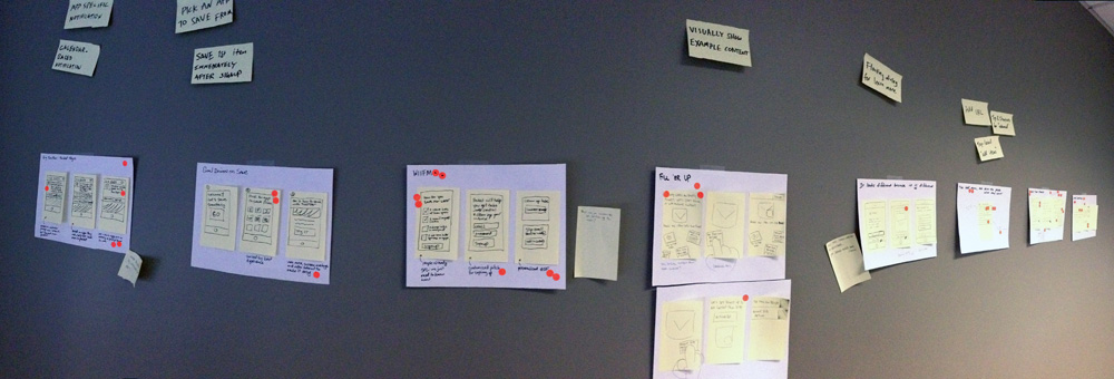
Mini-storyboards for the onboarding experience
VALIDATION
Yet another round of voting brings us to prototyping! Each team member took a story concept and brought it to life in a simple Keynote prototype. Now we're trying to piece together an actual flow, although we're doing so in a vacuum, not in the context of Pocket. After a few rounds of critique to get all the prototypes into a realistic, usable state, we're ready to start testing.
I won't go into the intricacies of running live user testing sessions with multiple prototypes, but we certainly didn't lack for feedback after the first round. From this stage, each consecutive week-long sprint involved refining the prototypes using the insights generated from the prior week's study and testing them again until we had a single prototype that combines the best aspects of the prototypes to date, addresses all the important problems, and encapsulates the experience we want people to have. I built this final prototype in the Pocket style, so we could transition seamlessly from prototype to working product in user testing.
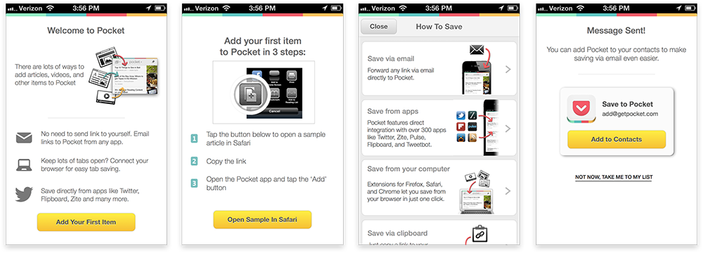
Screenshots from the final Keynote prototype for the new onboarding experience
RESULTS
As a result of launching the new onboarding experience, Pocket experience a 60% increase in activation for accounts created on mobile. While companies can typically hope for incremental KPI gains, this level of improvement was completely unexpected. An article about Pocket's success with this proejct goes into more detail about GV's design sprint methdology.
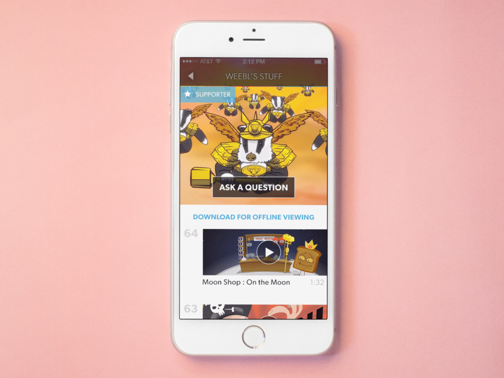
Pocket's app has evolved significantly since my time there, most notably because mobile operating systems now support native app integration (it's shocking to remember that this was not always the case!) But you can still see some of the output of this project in the "Learn How to Save" tutorial in the mobile apps on iOS and Android.
Other Projects
FlexCash Management
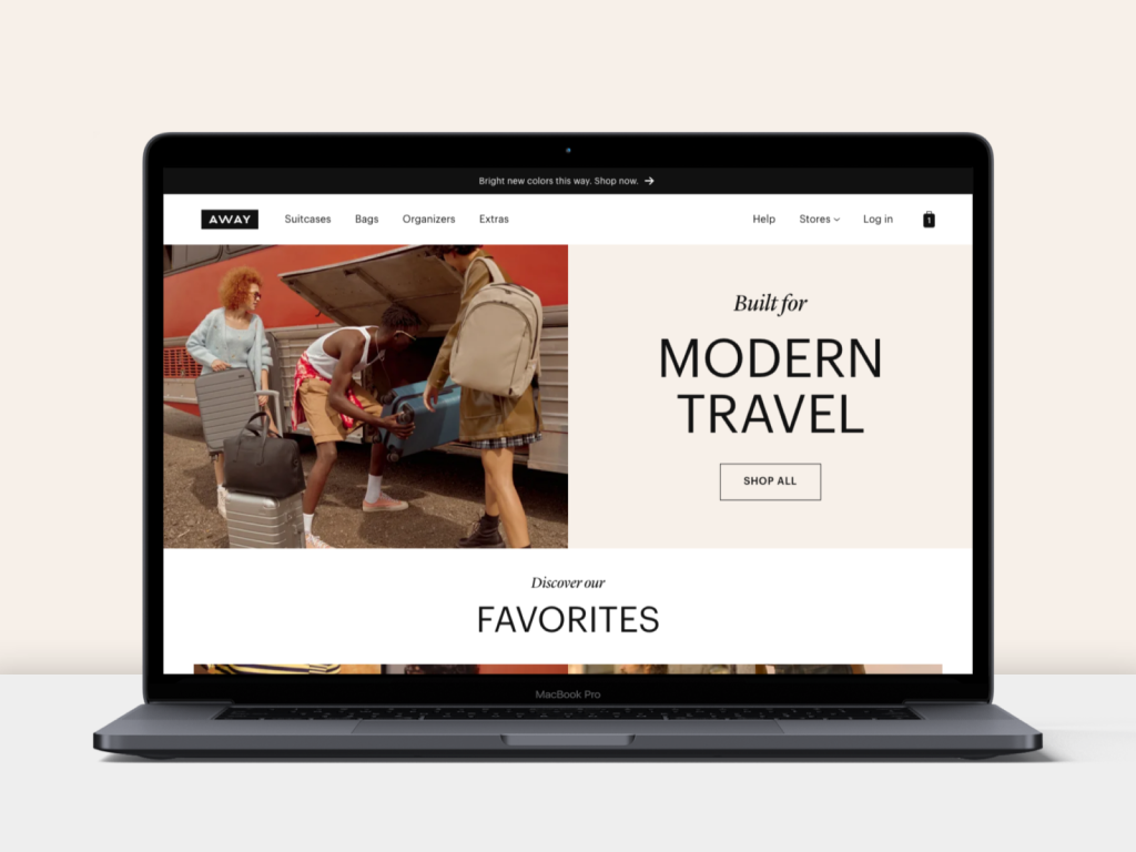
AwayWeb homepage
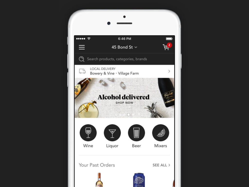
Minibar DeliveryE-Commerce mobile app
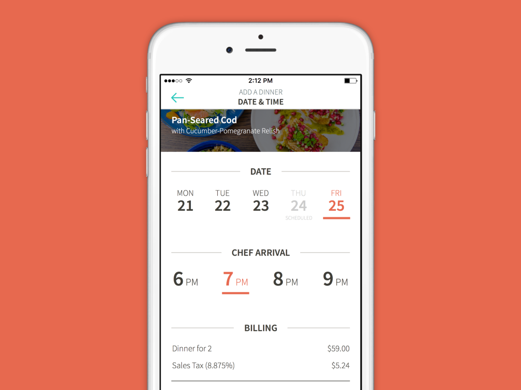
KitchensurfingFood service mobile app
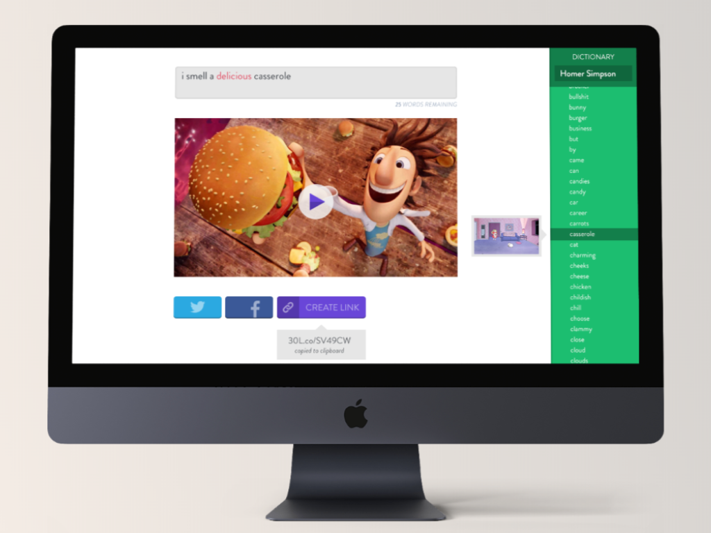
Thirty LabsBeta projects
Telecast (Betaworks)Video mobile app
Heartbreaker WallInteractive installation
