BACKGROUND
Away is a direct-to-consumer (DTC) retailer in the travel industry that grew rapidly in its early days, eventually reaching unicorn status in 2019. As with many DTC companies, Away drives the majority of its revenue via e-commerce (although they are expanding their brick-and-mortar presence.) When I joined in 2018, the company had no in-house engineers, but had realized that technology would play a pivotal role in scaling the brand.
PROBLEM
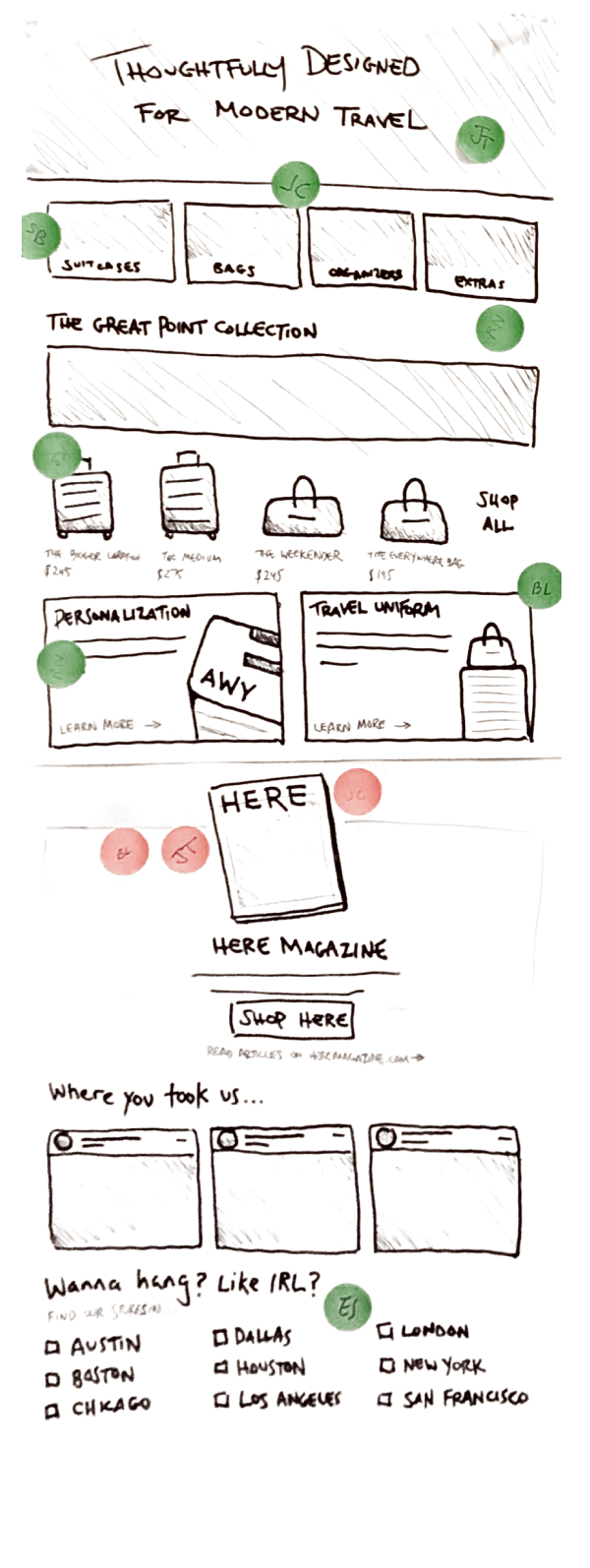
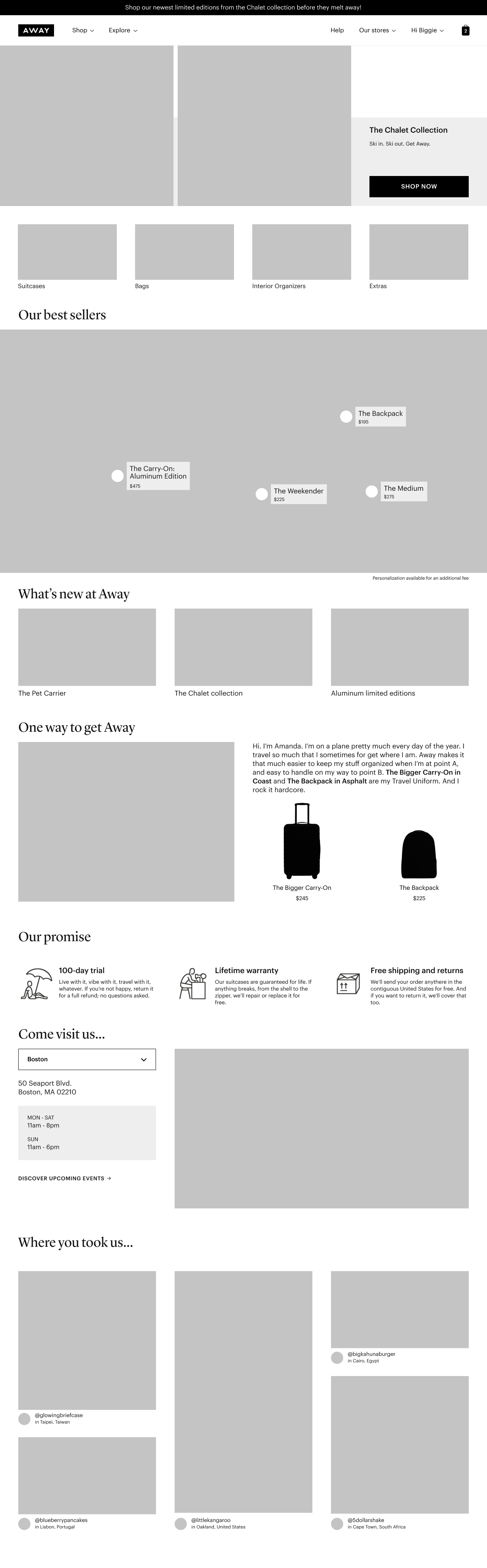
The old homepage (pre-2019)
Away's website was initially built to sell one product, and attempts to expand both the product offerings and digital features were haphazardly layered on top. The front-end platform was Backbone, which made maintaining and updating the site a labor-intensive proposition. But perhaps the biggest issue was that the site was not "designed" at all (in terms of combining a human-centric approach with digital best practices.) Instead, it had basically been somewhat arbitrarily cobbled together. This was perhaps most evident in the old homepage.
In thinking about the general goals of a homepage, the types of visitors who might end up there, and their individual expectations, it's clear that this page was falling short. Further, since (apart from the hero) it was comprised of a single hardcoded module, it was extremely limited in its messaging capabilities, and could not flex to accommodate varying brand needs.
So I set out to rethink not only the page design, but the role of the homepage in the customer experience and Away's marketing strategy.
DISCOVERY
Since the deliverables for this undertaking were not just a set of mockups, but a comprehensive digital strategy, I began by soliciting input from stakeholders. Given that the old homepage was mainly driven by marketing, I made it a point to include departments that typically aren't involved in digital product initatives: Growth (customer aquisition), Community (social media), Product (physical goods), Retail (brick-and-mortar stores), and our in-house publication Here Magazine. And of course, I consulted with the departments that often partnered with design: Creative, Brand Marketing, Product Marketing (merchandising.)
In parallel with the stakeholder consultations, I delved into competitive research. I learned that homepages are unlike most other pages and flows, which are bound by conventions to a certain degree. So every website has the opportunity to come up with their own approach and executions for their homepage. Through this research, I was able to draw parallels with Away's goals and identify specific content, features, or interactions which might translate well to our needs.
IDEATION
I began by collecting all of the stakeholder input and producing a list of goals (green Post-its.) Then, I translated these goals into content types (orange Post-its.) And finally, I came up with potential executions for each type of content (pink Post-its.)
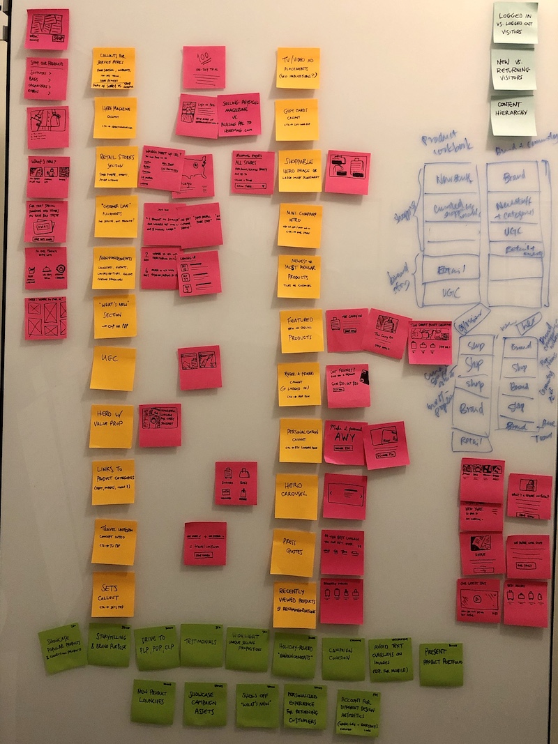
Early ideation for the homepage based on stakeholder input
Using all these ideas as a foundation, I was able to sketch out several different approaches. Each approach had a specific "driver" or intent, such as: conversion, holiday, brand storytelling, new customer acquisition, or new content showcase. I knew that ultimately the solution would incorporate many of these drivers, but this was a way to frame the discussion in a way that non-designers could understand.
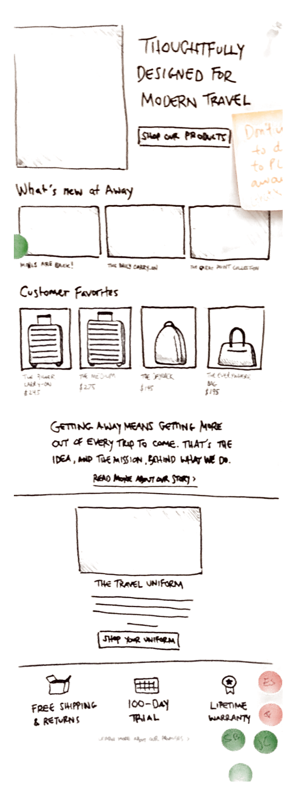
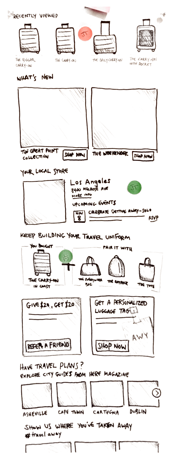
Sketches for the homepage configured with a specific intent
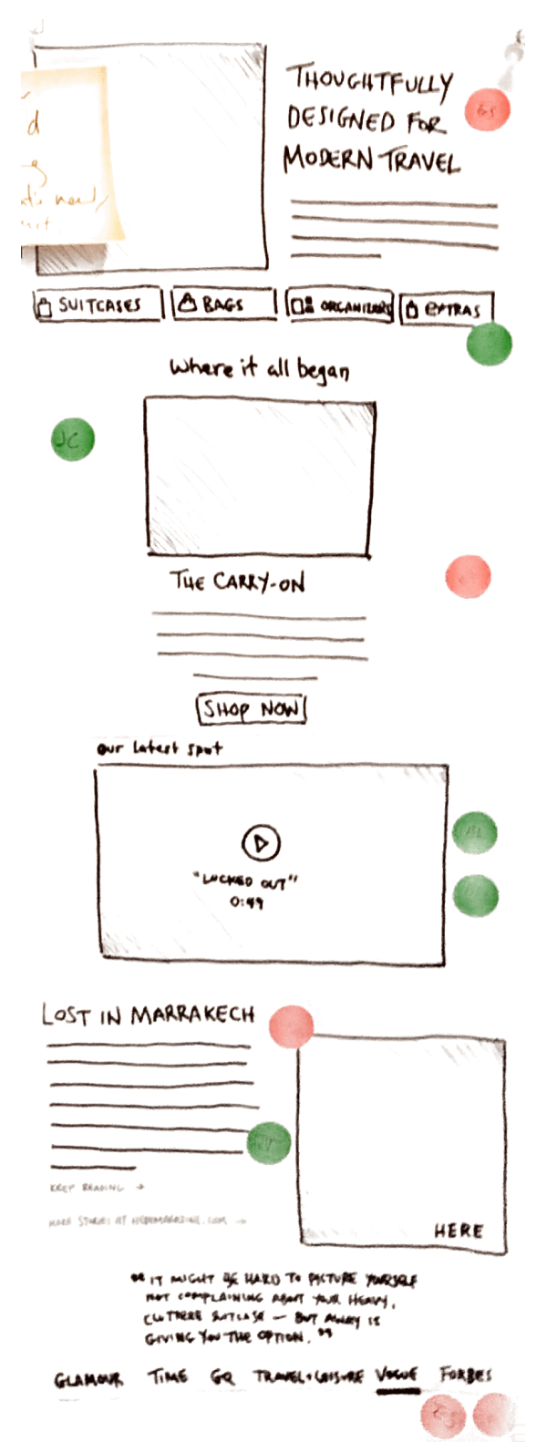
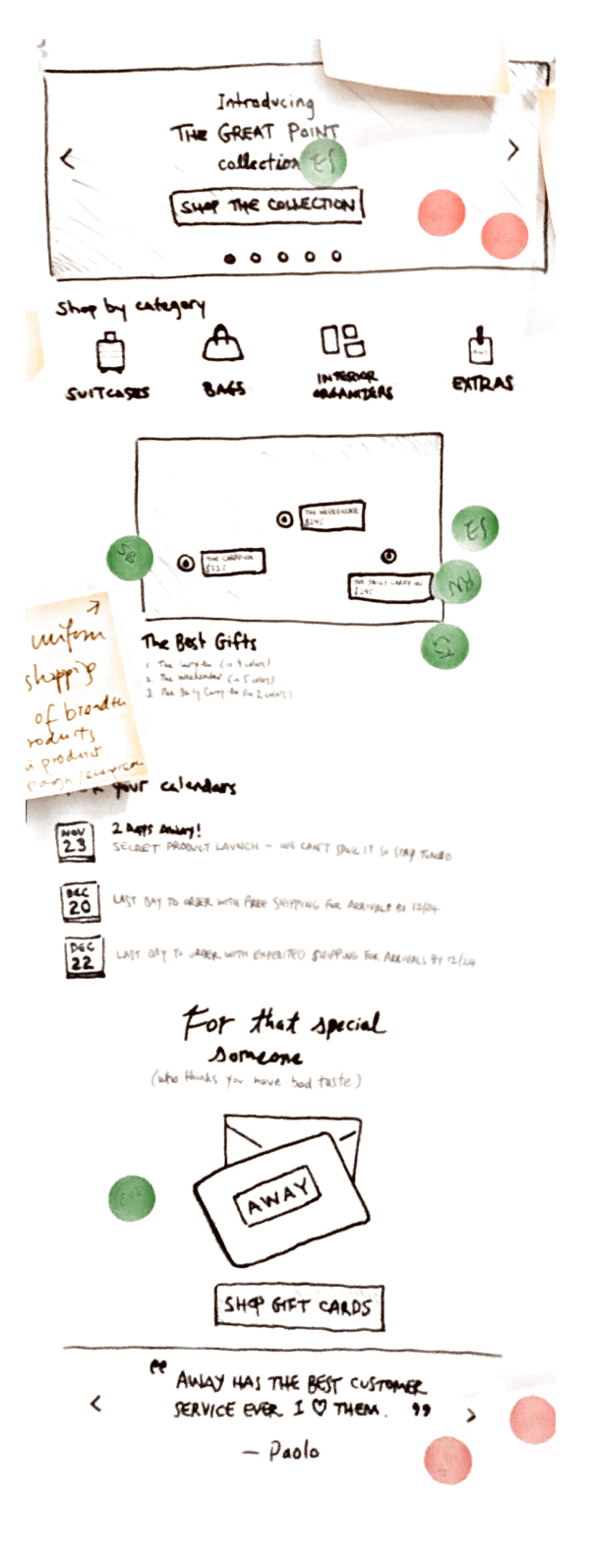
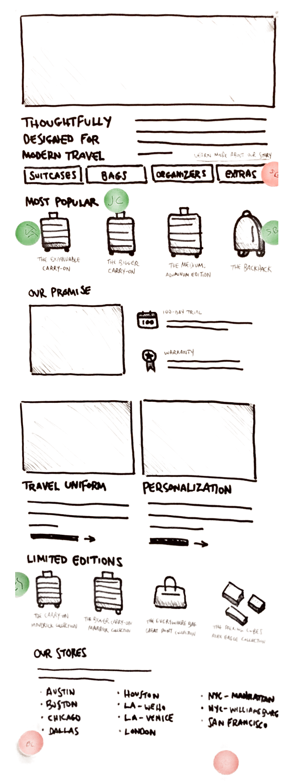
Based on the ideation feedback, I developed 2 different directions for the homepage. The first was more utility-oriented and focused primarily on driving customers to Product Listing Pages (PLP) and Product Detail Pages (PDP). The second was more brand-oriented, leaning more heavily on the latest launches and lifestyle content. So the first was more geared toward new customers and people who a more objective in their browsing habits, whereas the second made more sense for returning customers and people who are more receptive to storytelling. As such, I created these directions knowing that neither one was "correct" and that the best solution combined certain elements of each.
The ultility-oriented homepage wireframe
The brand-oriented homepage wireframe
VISUAL DESIGN
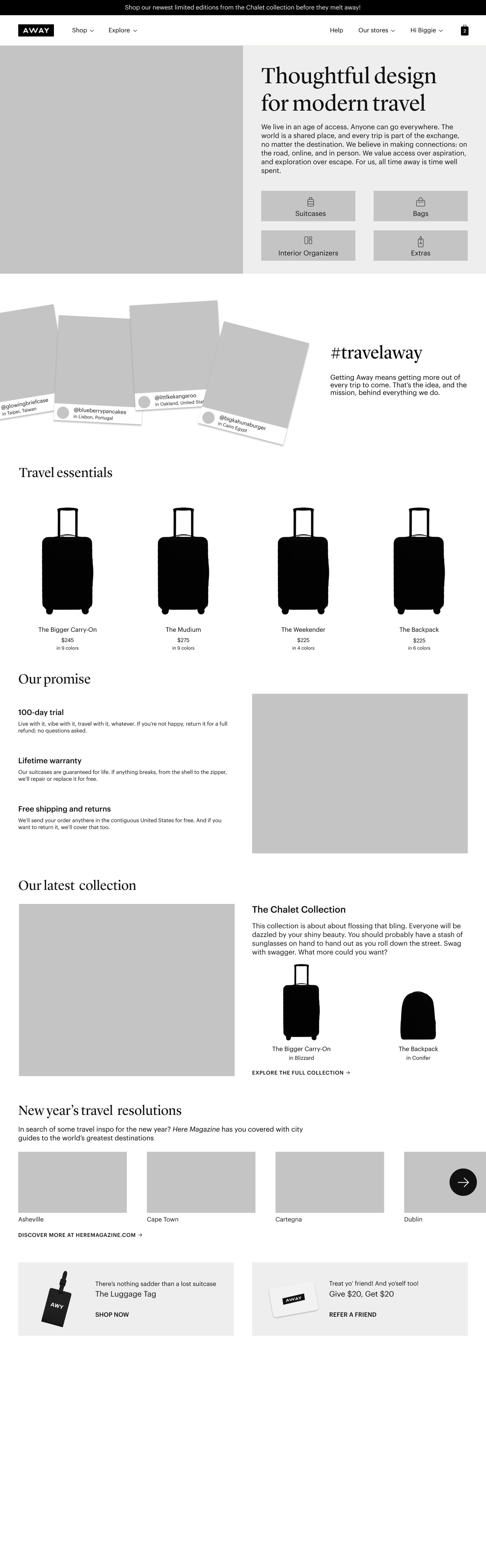
Similar to the wireframe process, I also developed 2 directions for visual design. It's worth noting that Away was working on a new brand identity while I was in the midst of this stage, so the team has to make some guesses about how the new page design might reflect the new identity. (Doesn't timing always seem to work out like this?)
One of the initial visual design directions for the new homepage
I worked with our UX Researcher, Ben, to test these 2 directions and gain some insight into both the content strategy, and look and feel. For the sake of brevity, I won't go into detail about the the visual refinement because of what happened next...
IMPLEMENTATION & RELEASE
Remember how I mentioned that the site had been build on Backbone? Our new engineering team had determined that this would be a great opportunity to begin migrating the site to React. So in launching the new website, we had a new design and a new framework. To try and mitigate any problems, we released the new homepage as an A/B test... and our new homepage performed worse than the old one. Our primary KPI was click-through (or "engagement" as we called it) and the new homepage had about 4% lower engagement. Of course, it took a lot to unpack what might have caused this. Was it the site performance of the new framework? Was it a device or browser issue we didn't catch in QA? Was it an issue with the design?
I came up with a few hypotheses to address the case where there might be a problem with the new design. The most notable one:
There aren't any buttons in the topmost viewport, so customers who aren't interested in the featured products will bounce.
Looking back on the wireframes, I had actually addressed this issue! But somehow through the iterations (and a bit of design by committee) the buttons got lost. So I went back to work tweaking the top module.
RE-RELEASE
After the update, engagement with the new homepage increased dramatically, outperforming the old homepage by about 6%. Beyond the click-through, we saw a big jump in page load speed, as well as code-less administrability. Because the page was designed and built with modular components, it enabled our marketing and merchandising teams to update the homepage with new content, experiment with changing the order and number of modules (and in some cases completely repurposing the module!)
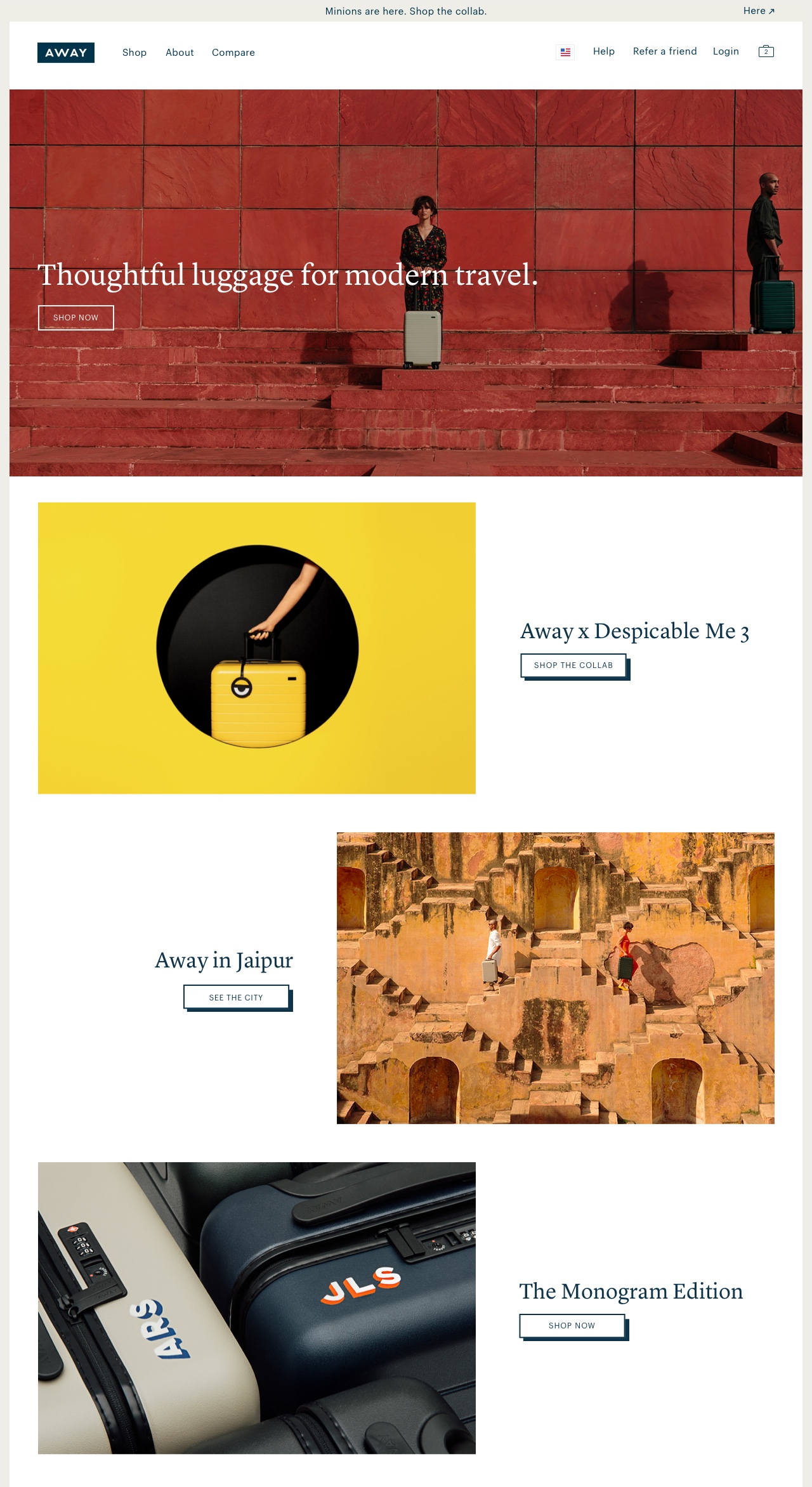
You can check out the homepage in its current incarnation at awaytravel.com.
Other Projects
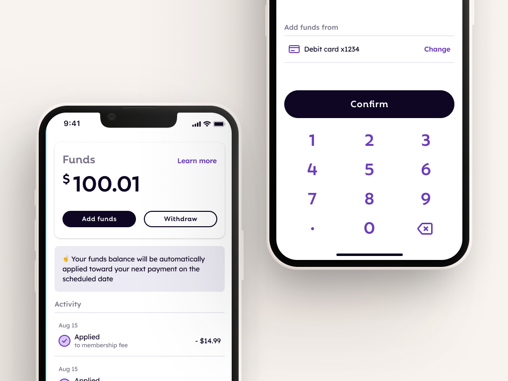
FlexCash Management
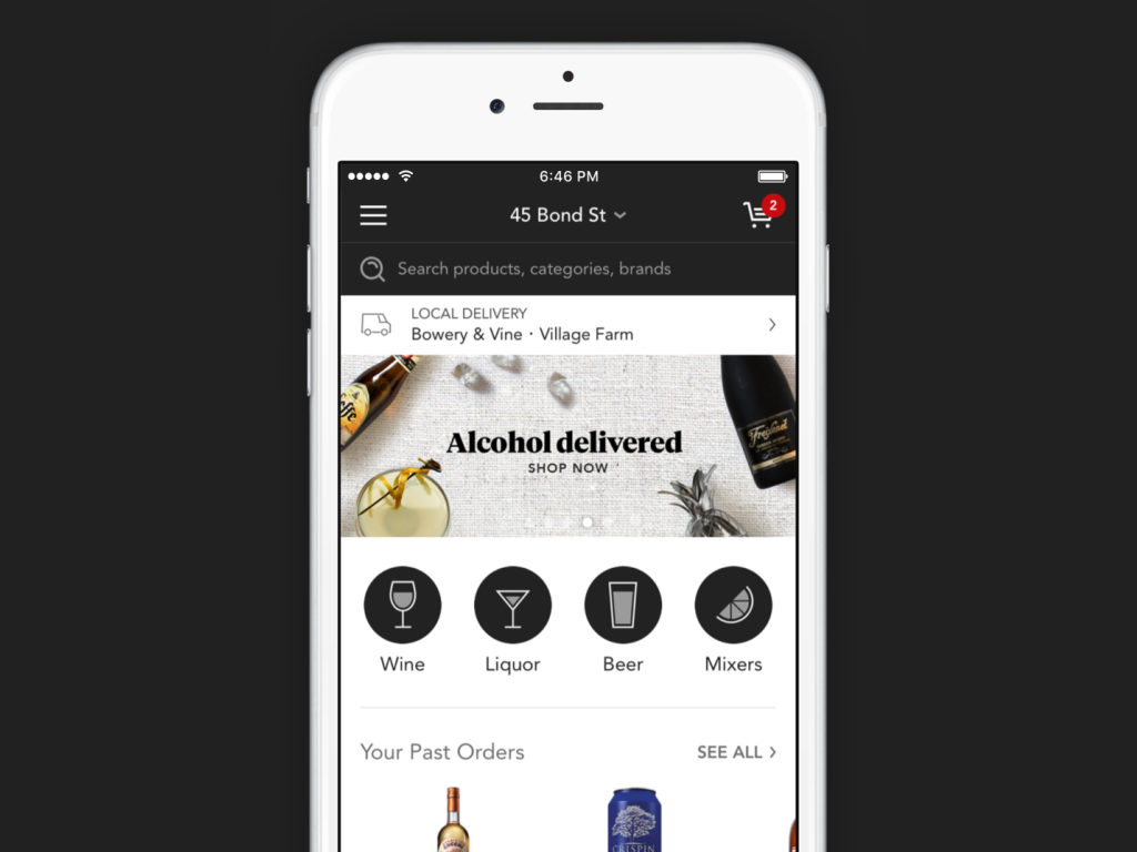
Minibar DeliveryE-Commerce mobile app
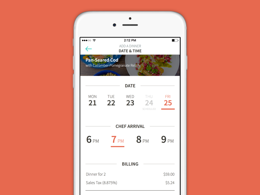
KitchensurfingFood service mobile app
PocketMobile app onboarding
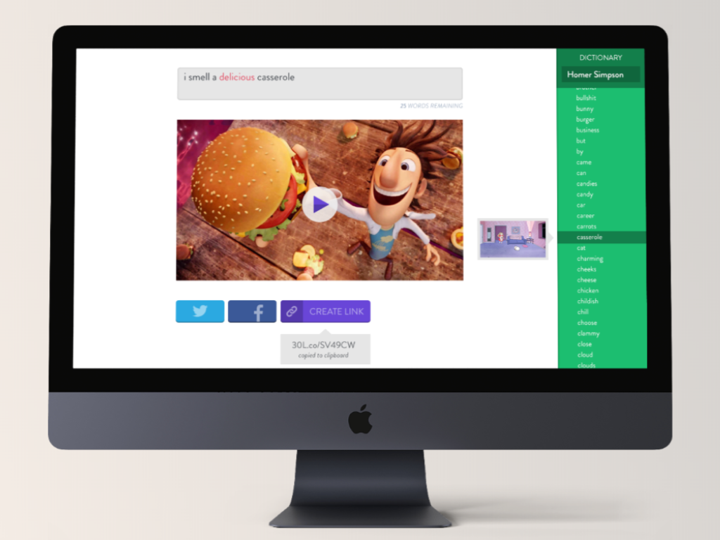
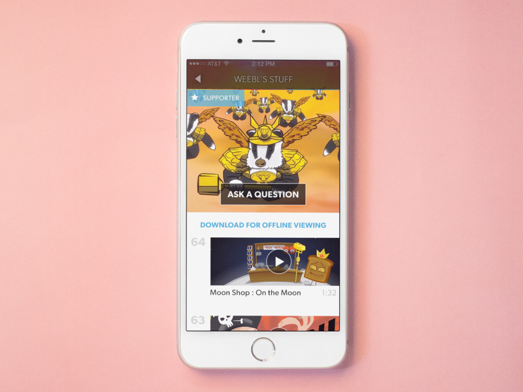
Thirty LabsBeta projects
Telecast (Betaworks)Video mobile app
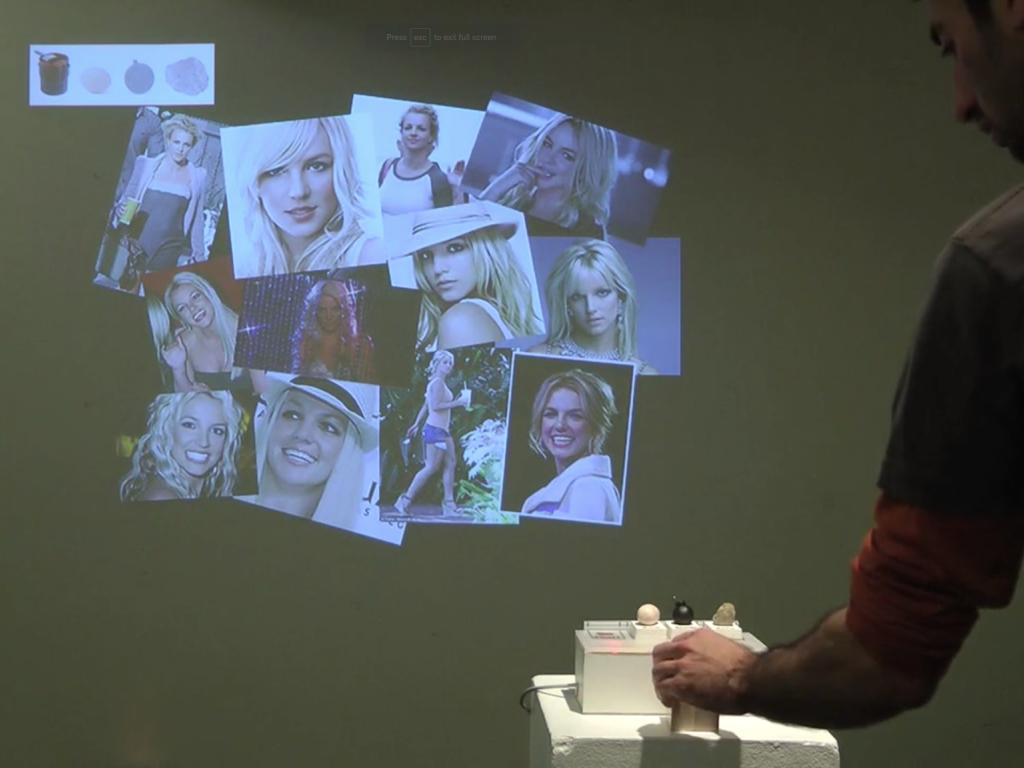
Heartbreaker WallInteractive installation
