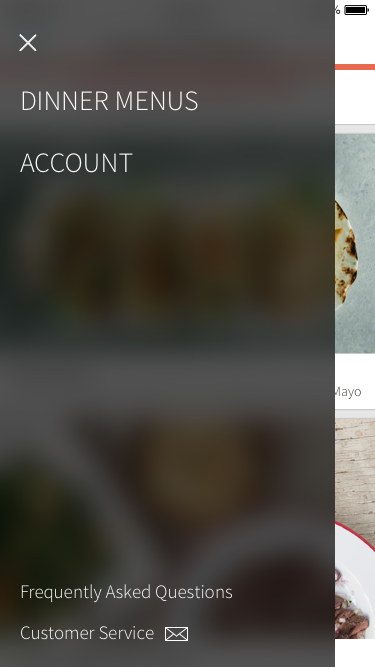
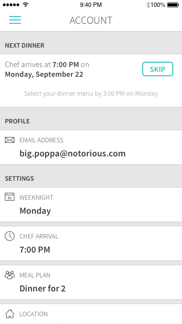
BACKGROUND
Kitchensurfing provides an innovative service in which professional chefs prepare restaurant-quality dinners in customer's kitchens at home. Though it began as a premium service primarily intended for special occasions, the company streamlined the logistics and lowered prices, reframing the product as a regular dinner solution, essentially an alternative to takeout.
During my year at Kitchensurfing, the company's business model underwent a number of shifts, which required us to overhaul all customer-facing digital components of the product (website, onboarding experience, dashboard, and mobile app.) So I designed a distinct iOS app in each instance, three in total. The most significant shift, transitioning to a weekly subscription, was perhaps the biggest design challenge I faced.
PROBLEM
While working on the web dashboard, I identified two high-level flows for existing customers...
- Choosing a dinner menu from a set of 5-6 options
- Making subscription changes such as setting a new date, time or number of guests
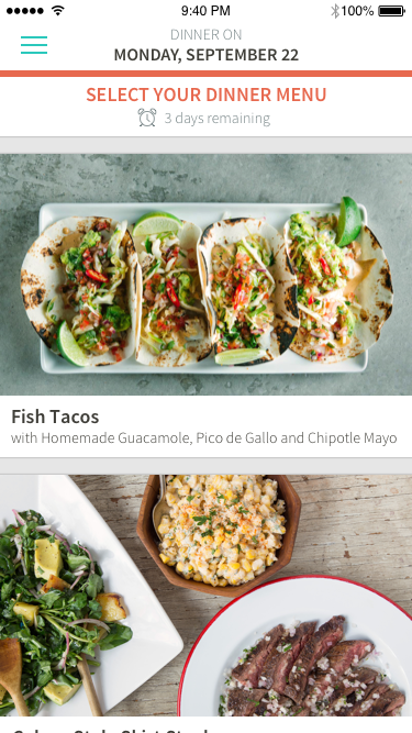
Although the company had originally conceived of the mobile app as duplicating the functionality of the dashboard, I strongly disagreed. I made the case that the mobile platform presented an entirely different use case. I argued the mobile app not need feature parity with the web dashboard, because subscription changes were akin to account management... something people do very rarely, and in fact, shouldn't be encouraged to do, because it undermines the benefit a subscription model (minimal cognitive load for the customer.) I envisioned the mobile app as a lightweight utility for quickly scanning our beautiful content, and making a selection. Ideally, customers should only use the app once a week for five minutes. After all, our success was measured in confirmed dinner services, not app engagement.
IDEATION & VALIDATION
Fortunately, I succeeded in convincing other stakeholders that my perspective on the app was sound, but I was working within some major time constraints since the app had to be ready when the business switched over to the subscription model. So I quickly began sketching and iterating on wireframes. These wires were very low-fidelity; just enough to get the idea across. One particular point of internal debate was my suggestion to use a "hamburger menu". Although, I generally avoid this design pattern because it's riddled with problems, it made a lot of sense in this case. We had only one primary flow, and we wanted to actively discourage customers from venturing outside of that flow. (Later, when we added additional flows, I transitioned the UI to a tab bar.)
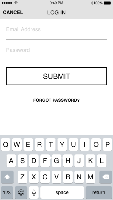
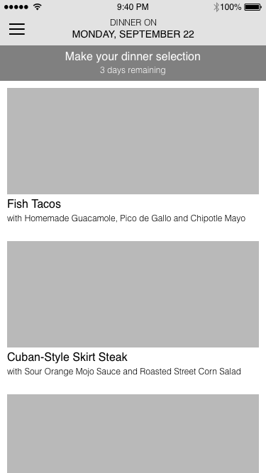
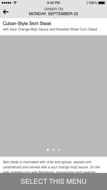
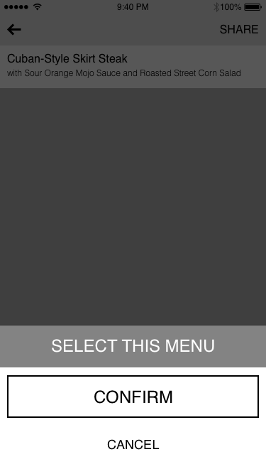
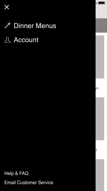
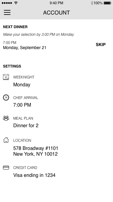
Wireframes for the subscription version of the mobile app
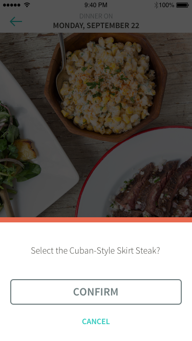
I combined these wireframes into a click-through prototype, and posted a task on Usertesting.com to get some quick feedback from external participants. One especially useful critique was the inability to change the menu selection. Although we weren't able to correct this in the initial release (due to some inflexibility in the backend implementation), it was prioritized as a fix for a subsequent release. But given the narrow scope of the app, participants didn't express confusion about the function of the app, or how to interact with it. So I was able to transition to visual design seamlessly.
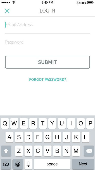
VISUAL DESIGN
INTERACTION & IMPLEMENTATION
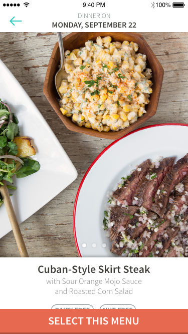
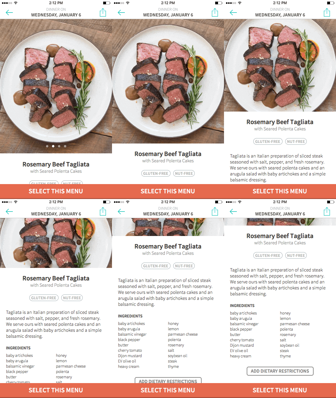
After several iterations on the visual mockups, I again compiled the screens into an interactive prototype. This prototype included some simple transitions and animations, but in the interest of speed, I withheld some of the more intricate interactions I had in mind. After locking down the mockups, I did some interaction prototyping, like this parallax effect which maintains focus on the pictured dish when scrolling through the details.
Other Projects
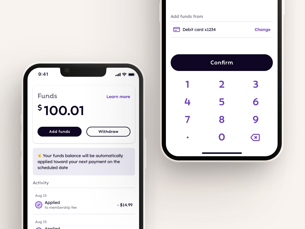
FlexCash Management
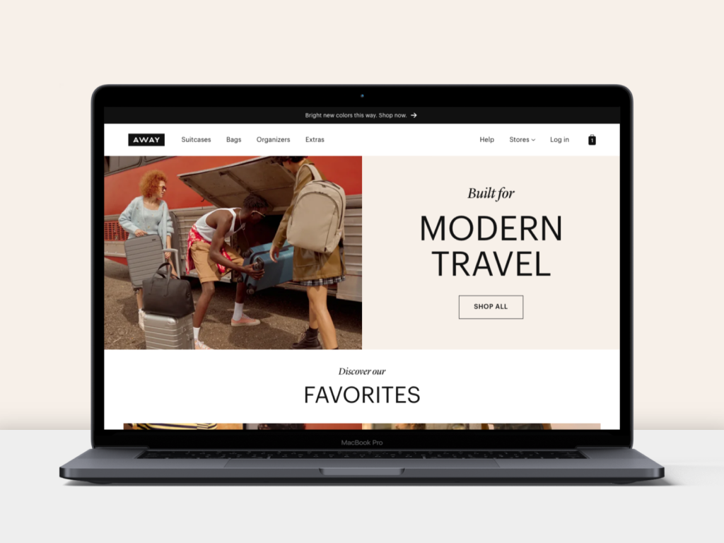
AwayWeb homepage
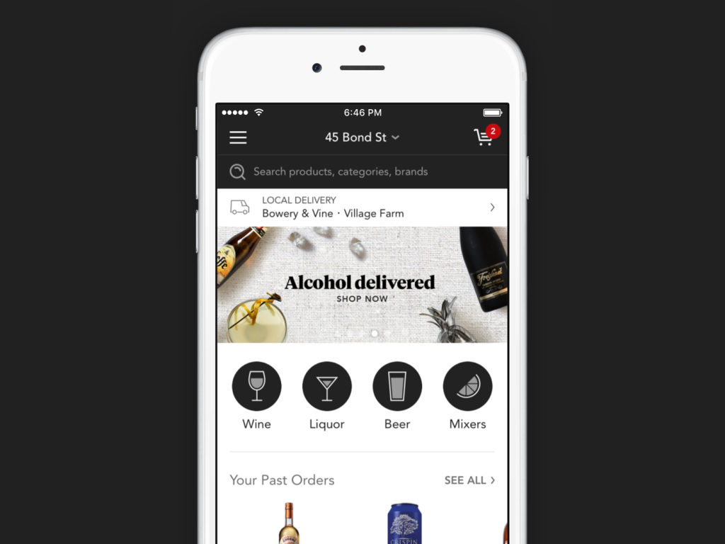
Minibar DeliveryE-Commerce mobile app
PocketMobile app onboarding
Thirty LabsBeta projects
Telecast (Betaworks)Video mobile app
Heartbreaker WallInteractive installation
