BACKGROUND
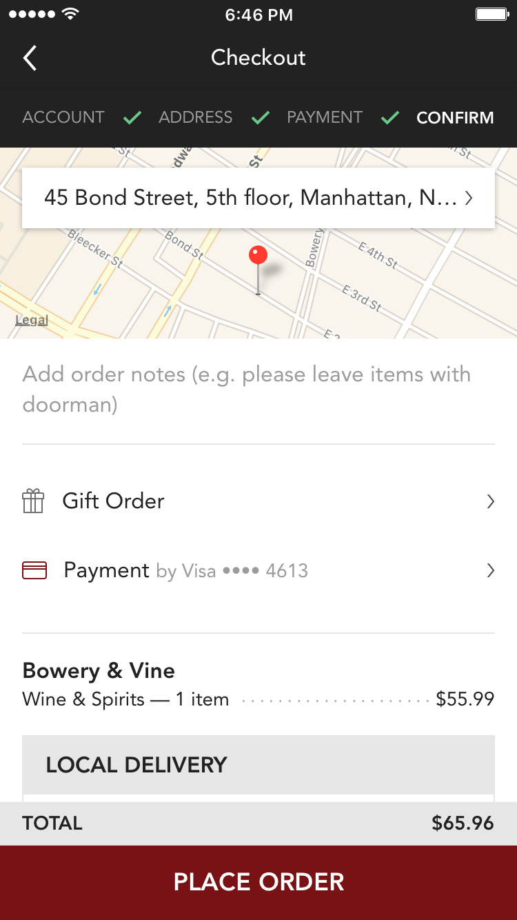
Minibar Delivery originated as a service providing on-demand delivery of wine, spirits, and beer. Similar to most food delivery platforms, Minibar partners with local suppliers who hold the inventory and execute the deliveries. Over my time there, services expanded to include store pickup, nation-wide shipping, cocktail recipes, and a platform for brand and store partnerships.
PROBLEM
For most on-demand services, the majority of customers place orders via mobile apps, and Minibar was no exception. However, Minibar's mobile ordering data was showing some problematic trends. The primary KPI was conversion rate, which was below industry benchmarks. And perhaps more indicative were the secondary KPIs, AOV (Average Order Value) and UPT (Units Per Transanction), which were far below desktop rates. Also considering the overall lack of engagement, it was evident that there was plenty of opportunity for improvement. Further, a bug-riddled Android app essentially restricted usage to iOS devices.
The existing iOS app hadn't been updated in years, and was showing its age. When I was hired, the co-founders had already determined that a full redesign was necessary.
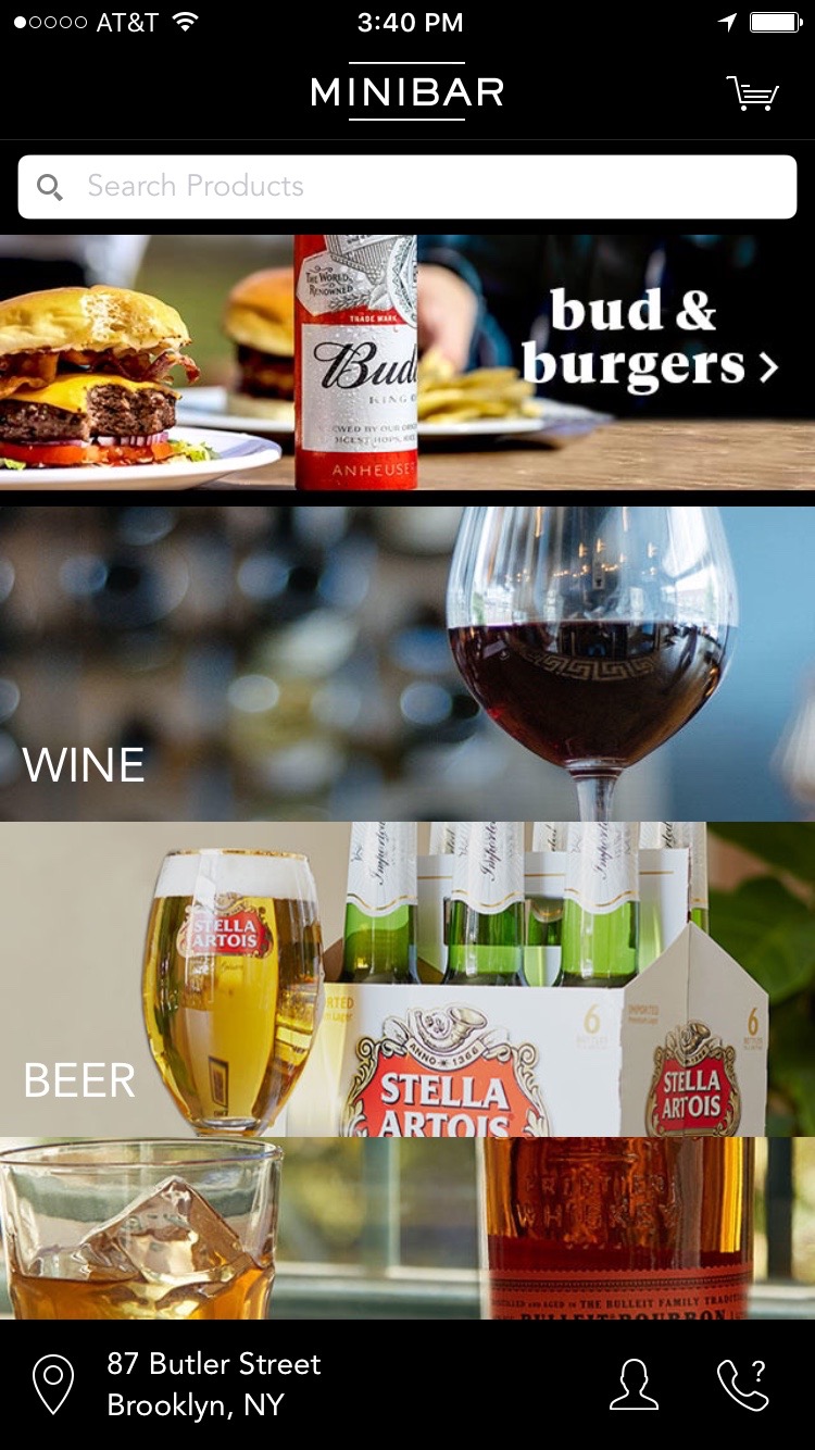
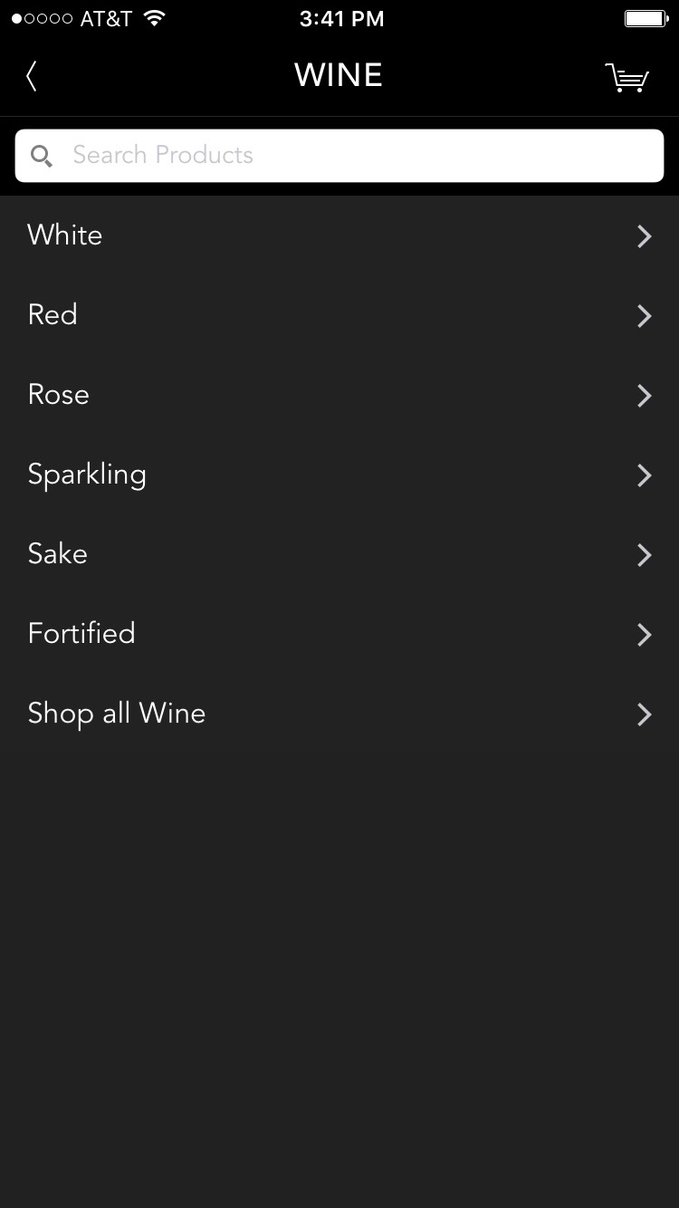
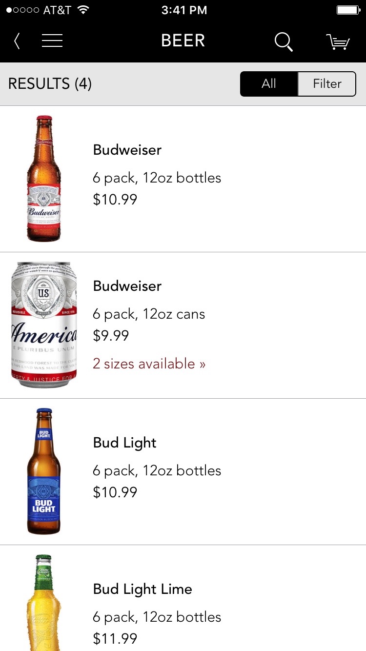
The product navigation flow for the old iOS app
DISCOVERY
As I typically do, I started off by gathering insights to help define the problems from a human perspective. I recruited a handful people who weren't familiar with Minibar as part of an ethnographic study about mobile shopping. During the interviews, I asked participants to demonstrate how they shop on their phone, and to show off the retail apps they find themselves returning to again and again.
The insights gathered from the interviews indicated that beyond adhering to basic usability conventions, there were opportunities to dramatically improve product discovery and navigation. The linear flow of the existing app was a blunt force tool that drove people down the funnel, but made it difficult to get anywhere else, hence the low UPT metrics.
IDEATION
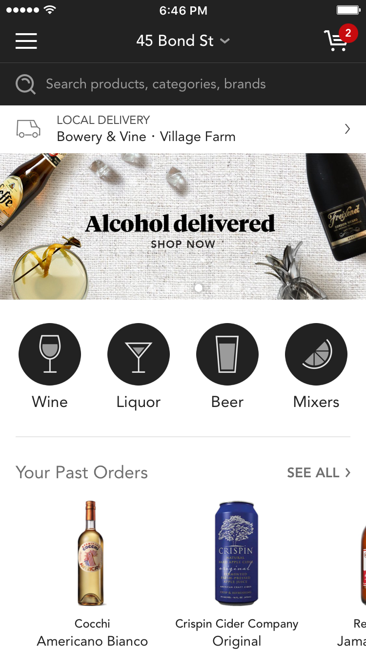
For the sake of brevity, I'll focus on an individual touchpoint that proved pivotal in product discovery: the homescreen. As the first screen that people see when they launch the app, the homescreen serves as a hub that offers straightforward access to all of the product-finding pathways: search, categories, data-driven content, curated content, etc. I made heavy use of pen and paper to explore possible executions.
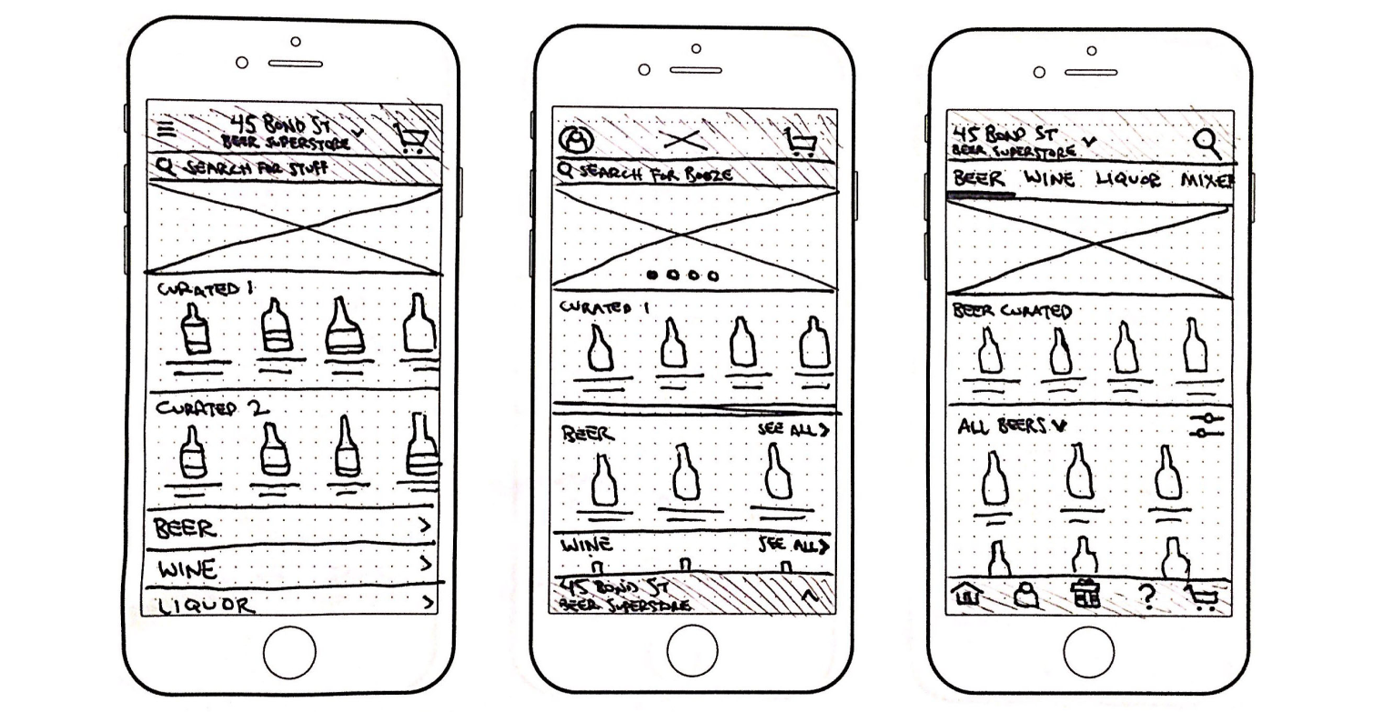
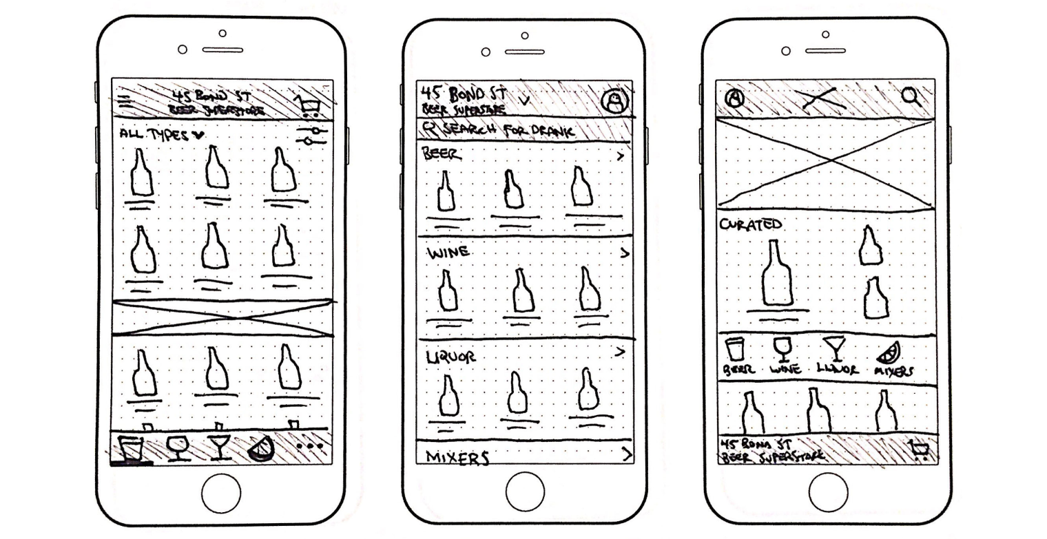
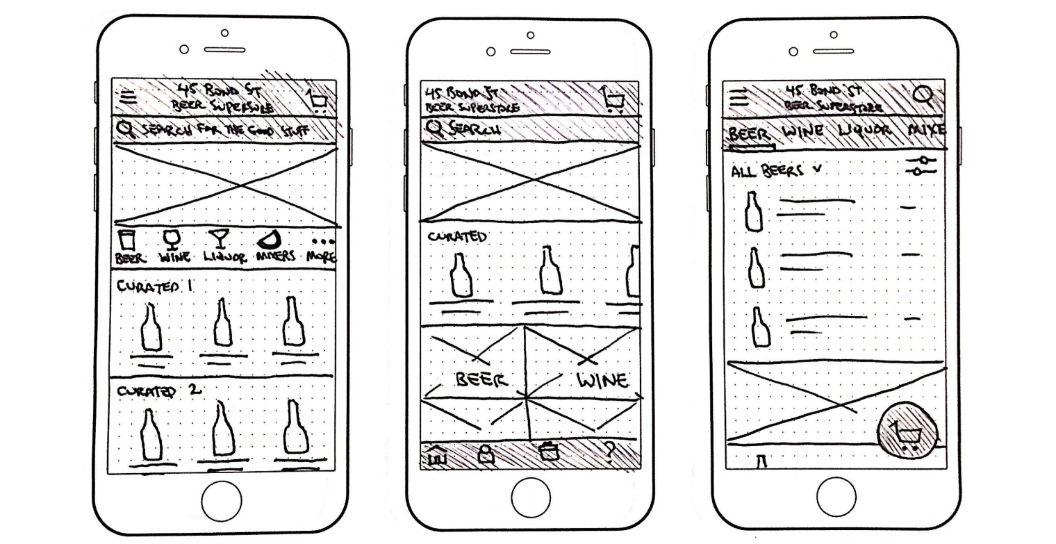
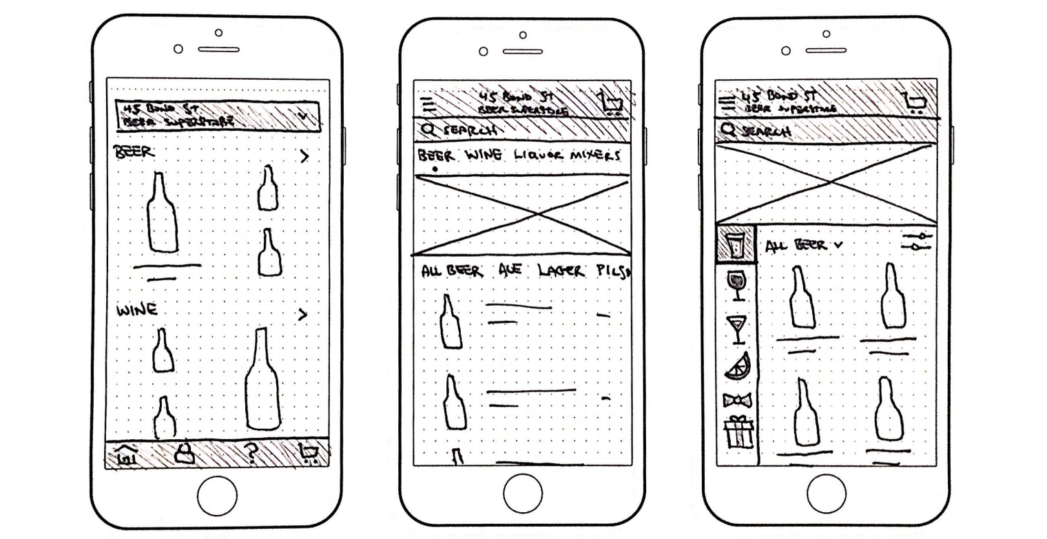
Exploration sketches for the new homescreen
DESIGN SYSTEM
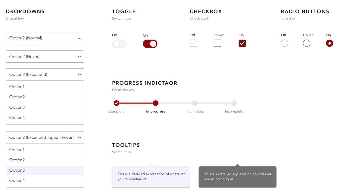
While Minibar had a brand guide, it lacked a formal design system. Redesigning the app presented the perfect opportunity to create one.
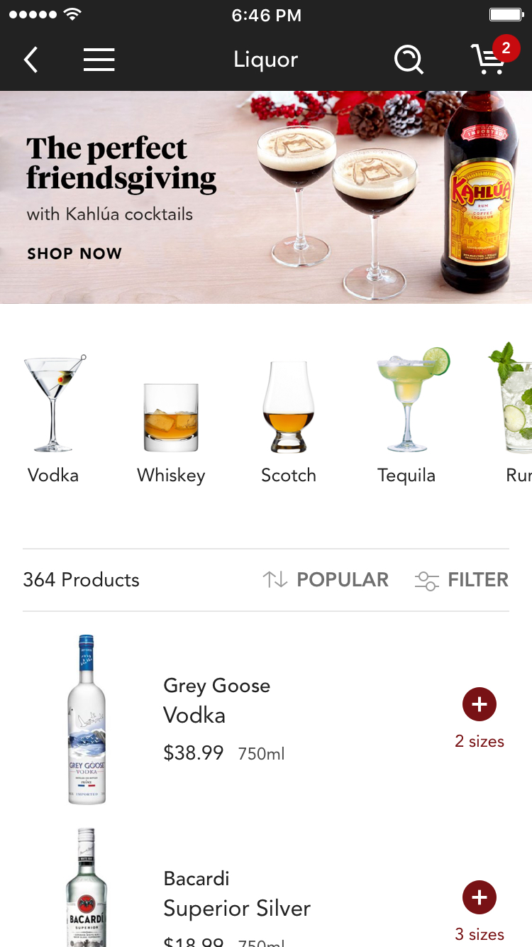
In order to maintain the clear product finding pathway of the existing app, while creating a dynamic space that allowed for discovery, I advocated for a modular platform. I defined a set of modules (e.g. banner carousels, product sliders, featured products, and brand placements) and coordinated with the engineering team to create a rudimentary CMS to power a prototype. That prototype eventually grew into the system that powers the homescreen today.
The dynamic content is controlled both systematically (by a recommendations algorithm) and manually (by our marketing team) all while controlling the inventory shown based on the customer's location.
INTERACTION & IMPLEMENTATION
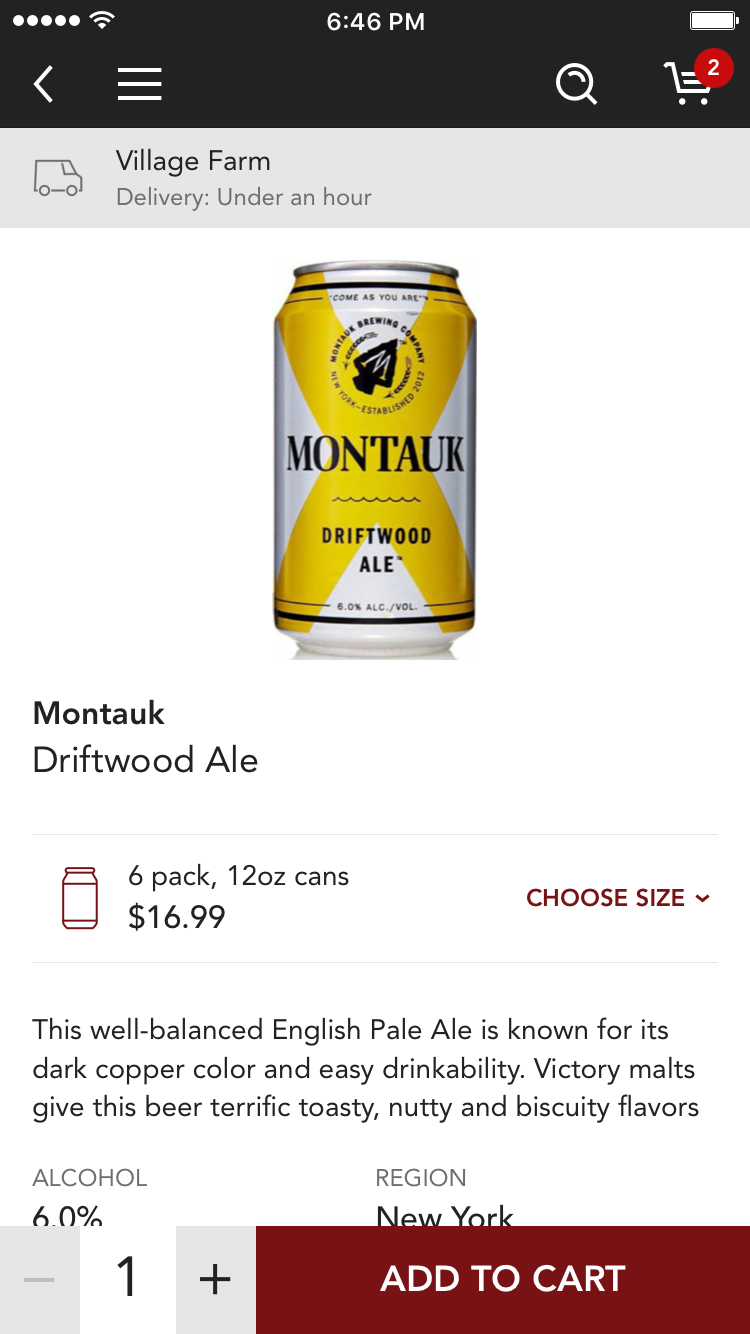
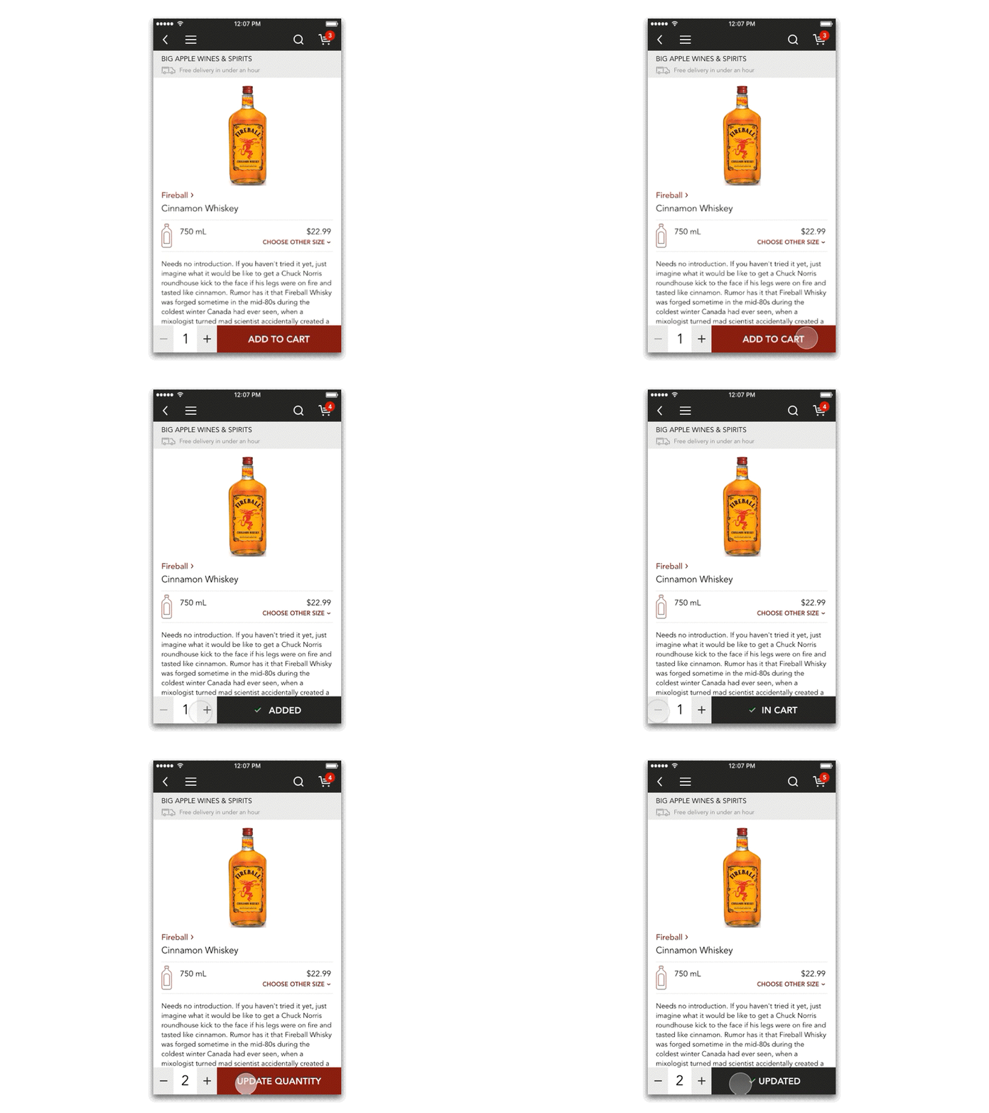
I conducted a usability study using a prototype powered by the CMS to identify interactions issues. One such issue was how the app reflected products added to cart, which cause some confusion. For alcohol products, customers frequently purchase multiples, so it was critical to visually reinforce quantity.
The new app is built in React Native, which allowed us to use the same underlying system to power the app across iOS and Android. Some notable accomplishments of the new app include a 13% increase in AOV and a 9% increase in conversion. This story only touches on a fraction of the process and work that went into designing an entirely new app for Minibar, so feel free explore the app for yourself on iOS or Android.
Other Projects
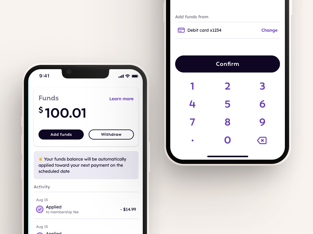
FlexCash Management
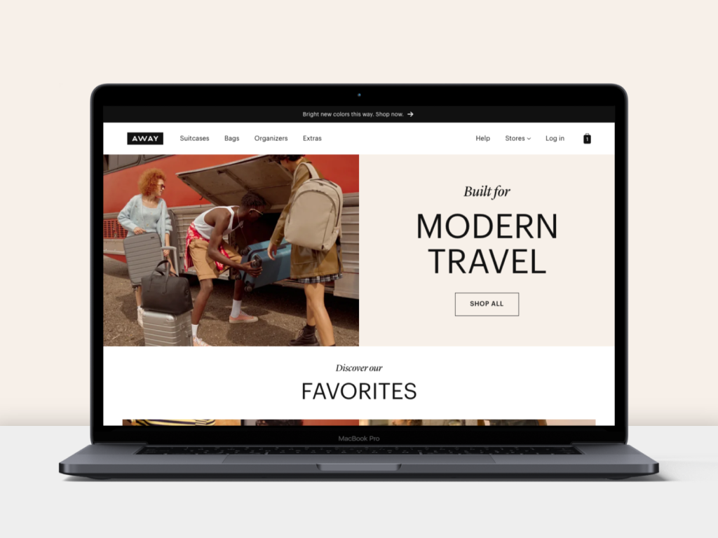
AwayWeb homepage
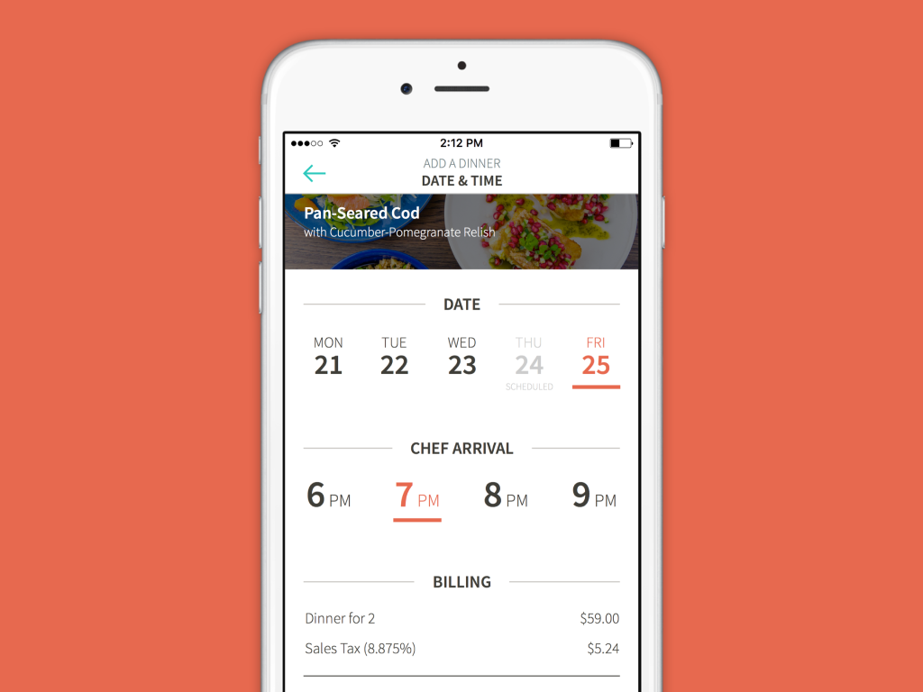
KitchensurfingFood service mobile app
PocketMobile app onboarding
Thirty LabsBeta projects
Telecast (Betaworks)Video mobile app
Heartbreaker WallInteractive installation
