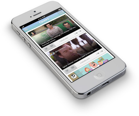
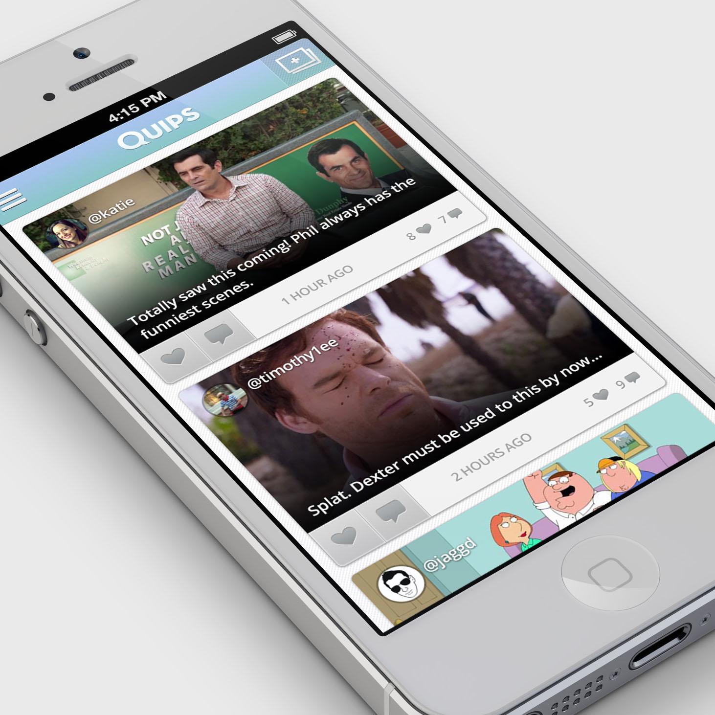
 When I joined Miso in the fall of 2012, the company had recently pivoted away from their old product (also called Miso.) The old product is a second-screen social TV application that supplies an enhanced while-you-watch experience, but it had seen very slow growth over the previous couple years. Their new concept, Quips, is still a social TV product, but one that isn't tied to TV-watching. I describe Quips as "Instagram for TV", other people have called it a "TV meme maker."
Although Miso had employed a handful of designers over the years, I became the team's only designer shortly after I joined. When it came to product, I did everything short of coding. This included prototyping, interaction design, user research, usability testing, UI design, marketing graphics production, and even some video production. (I had the help of a contract visual designer who helped kick off the branding and product look in the first couple weeks.)
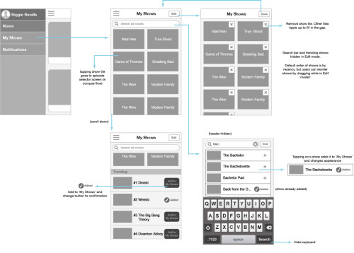
I'll walk through one of the design challenges I faced early on as an example of my process. One of the critical aspects of the product is ensuring people see content that interests them. If you don't watch The Bachelorette, chances are pretty good that you aren't interested in content from that TV show.
I always begin by trying to understand the problem I'm trying to solve before I go about solving it. So I busted out the good ol' Post-It notes, and channeled potential users of the product by writing "I want to..." statements in their voices. For example...
"I want to have a way to only see stuff related to the shows I watch."
But also...
"I want to see what my friends are talking about, even if it's not a show I watch."
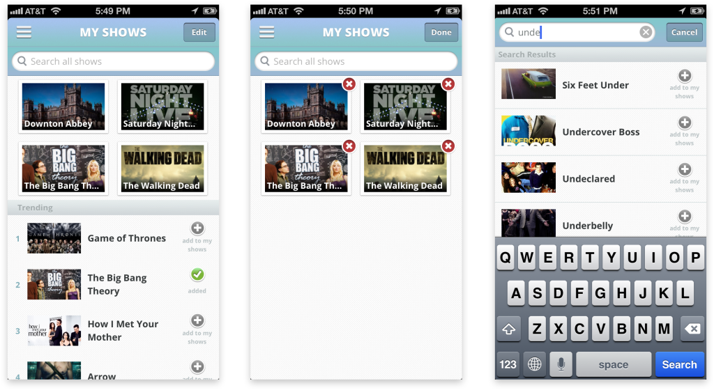
I wrote down as many as I cold think of, trying to stretch my imagination to the unlikeliest scenarios in order to reach the full spectrum of use cases. First things first, how can we solve for the first "I want to..." The approach I ended up taking (and we did consider others) was to allow people to curate a list of shows.
From here, I sketched. Early sketches look something like this:
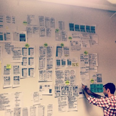
Quick and dirty. Quantity over quality. This stage is about documenting ideas. I do this a lot. This is what my workspace looked like:
I tend to take every opportunity to gather feedback. Sometimes just from my team, sometimes from designer friends, sometimes from actual users, and sometimes from totally random people. After incorporating any feedback I've received, it's onto figuring out how all the bits and pieces work.
I might do a low-fidelity prototype at this stage, or do testing later in the context of the app as a whole. But in either case, eventually I have the task of making everything look good and injecting joyful details that make people smile.
And after the product is built, we have to help people understand how awesome it is. There are countless ways to do this, and we tried out a lot of them. But the product video is always a tried and true method, or at least worth putting a week's effort into while we were waiting for App Store approval.
A couple months after Quips launched, Miso was acquired by Dijit, which was a bittersweet ending to my time at the company. The acquisition proved that Miso had gained traction in a challenging space, but it also meant my team had to move on to new challenges. And unfortunately, Quips would no longer be updated or supported.

No comments.