April 7, 2016Comments are off for this post.

Kitchensurfing

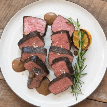
Kitchensurfing provides an innovative service in which professional chefs prepare restaurant-quality dinners in customer's kitchens. Though it began as a premium service primarily intended for special occasions, the company streamlined the logistics and lowered prices, reframing the product as a regular dinner solution, essentially an alternative to takeout.

During my year at Kitchensurfing, the company's business model underwent a number of shifts, which required us to overhaul all customer-facing digital components of the product (website, onboarding experience, dashboard, and mobile app.) So I designed a distinct iOS app in each instance, three in total. The most significant shift, transitioning to a weekly subscription, was perhaps the biggest design challenge I faced.

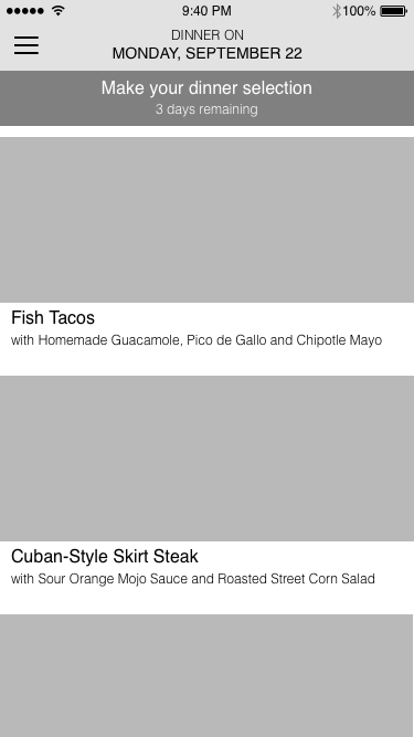
While working on the web dashboard, I identified two high-level flows for existing customers...

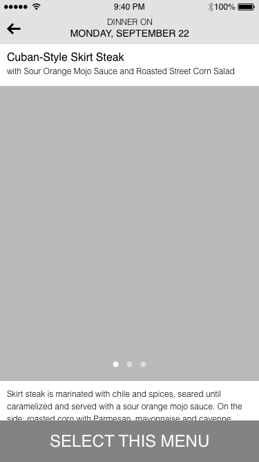
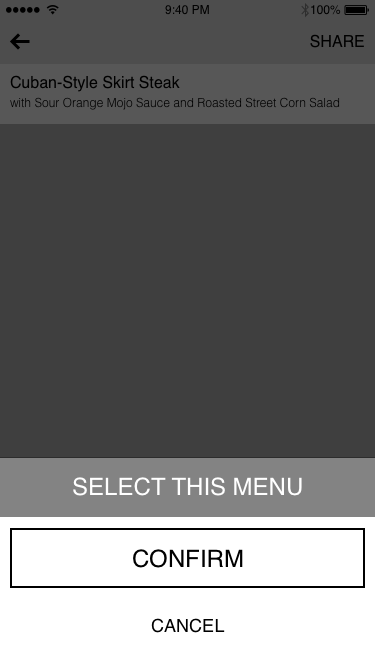
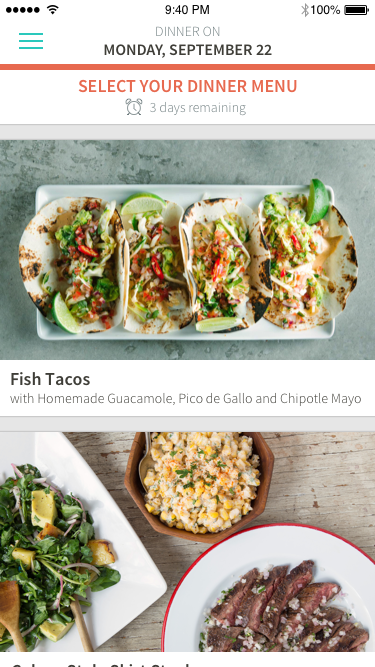
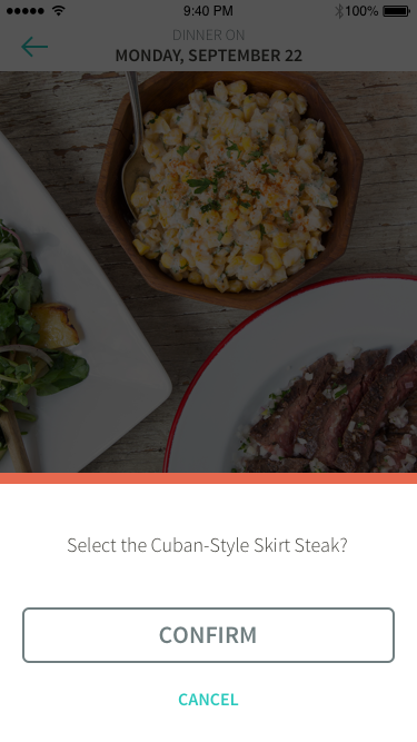
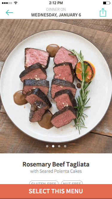
  • Choosing a dinner menu from a set of 5-6 options
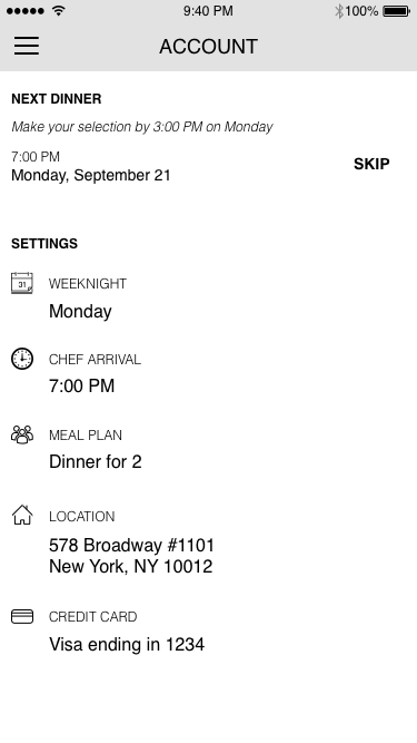
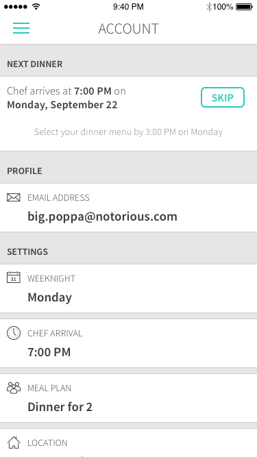
  • Making subscription changes such as setting a new date, time or number of guests

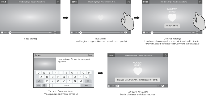
Although the company had originally conceived of the mobile app as duplicating the functionality of the dashboard, I strongly disagreed. I made the case that the mobile platform presented an entirely different use case. I argued the mobile app not need feature parity with the web dashboard, because subscription changes were akin to account management... something people do very rarely, and in fact, shouldn't be encouraged to do, because it undermines the benefit a subscription model (minimal cognitive load for the customer.) I envisioned the mobile app as a lightweight utility for quickly scanning our beautiful content, and making a selection. Ideally, customers should only use the app once a week for five minutes. After all, our success was measured in confirmed dinner services, not app engagement.

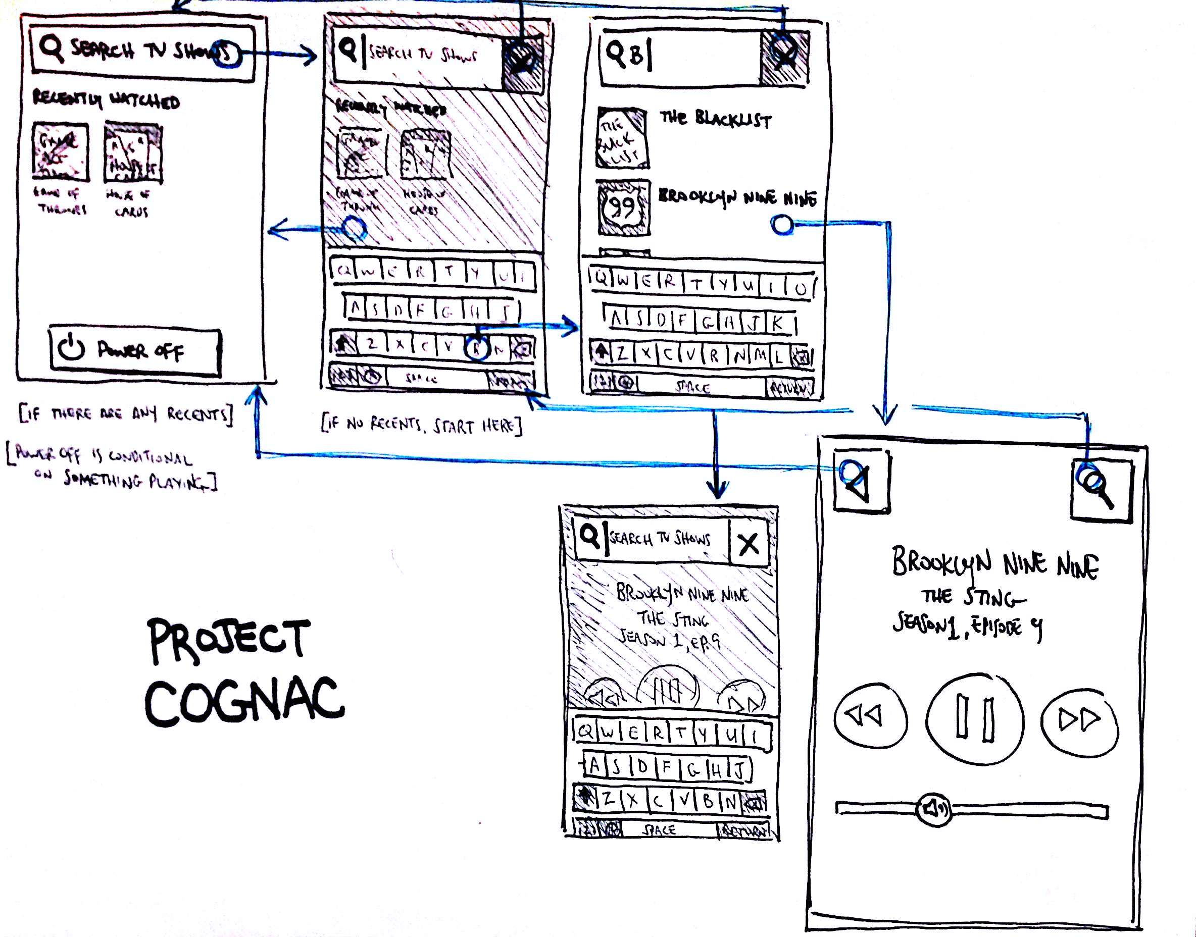
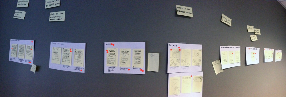
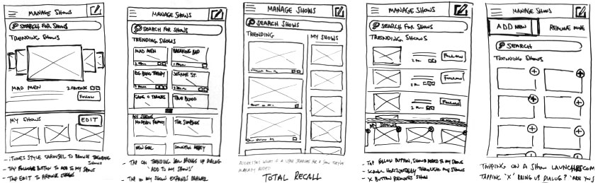
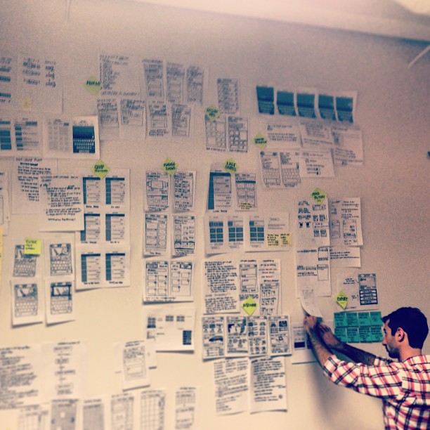
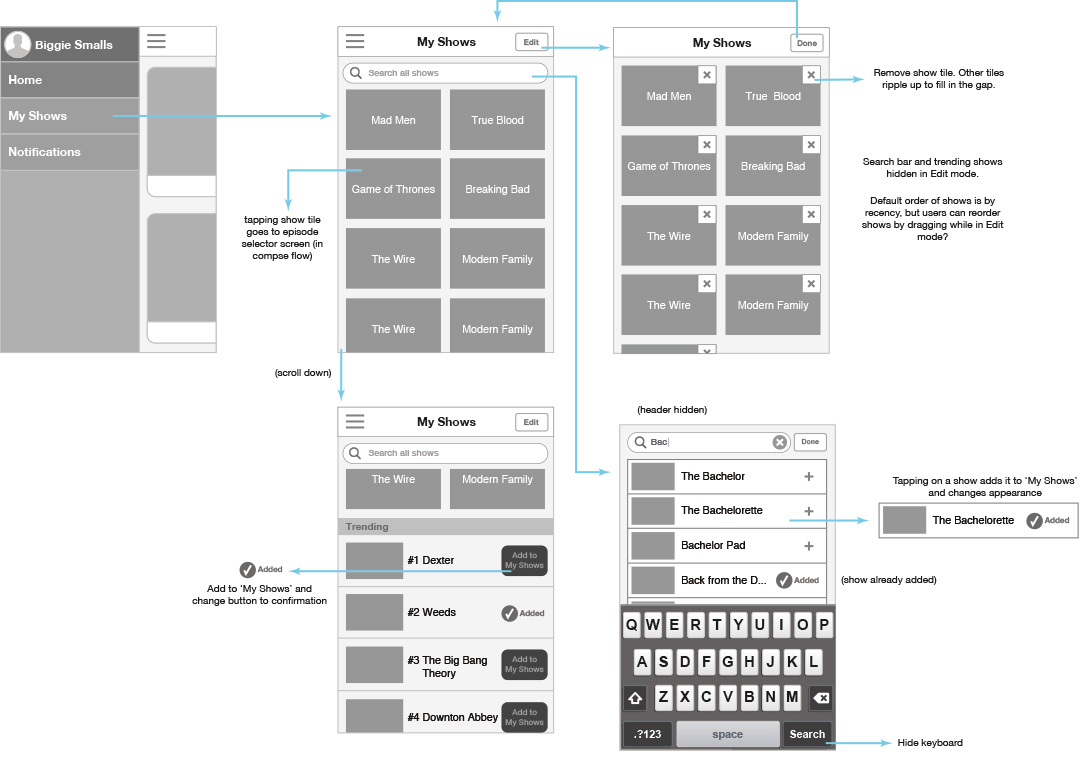
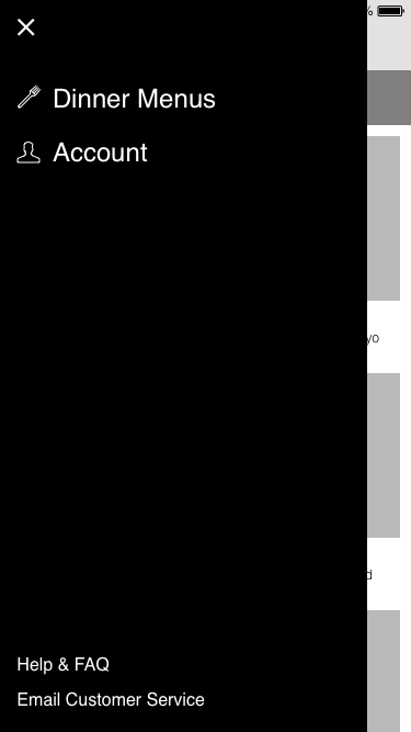
Fortunately, I succeeded in convincing other stakeholders that my perspective on the app was sound, but I was working within some major time constraints since the app had to be ready when the business switched over to the subscription model. So I quickly began sketching and iterating on wireframes. These wires were very low-fidelity; just enough to get the idea across. One particular point of internal debate was my suggestion to use a "hamburger menu". Although, I generally avoid this design pattern because it's riddled with problems, it made a lot of sense in this case. We had only one primary flow, and we wanted to actively discourage customers from venturing outside of that flow. (Later, when we added additional flows, I transitioned the UI to a tab bar.)


wire0    wire2 wire3  wire4 


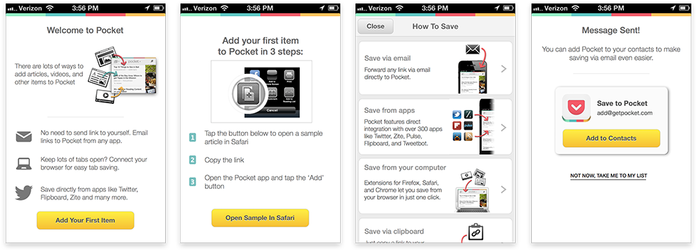
I combined these wireframes into a click-through prototype, and posted a task on Usertesting.com to get some quick feedback from external participants. One especially useful critique was the inability to change the menu selection. Although we weren't able to correct this in the initial release (due to some inflexibility in the backend implementation), it was prioritized as a fix for a subsequent release. But given the narrow scope of the app, participants didn't express confusion about the function of the app, or how to interact with it. So I was able to transition to visual design seamlessly.


viz0  viz1  viz2 viz3  viz4  viz5


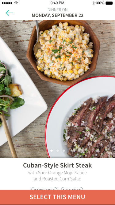
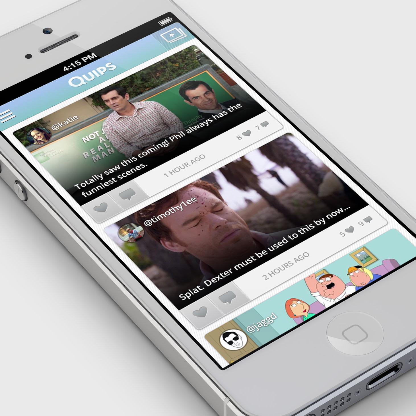
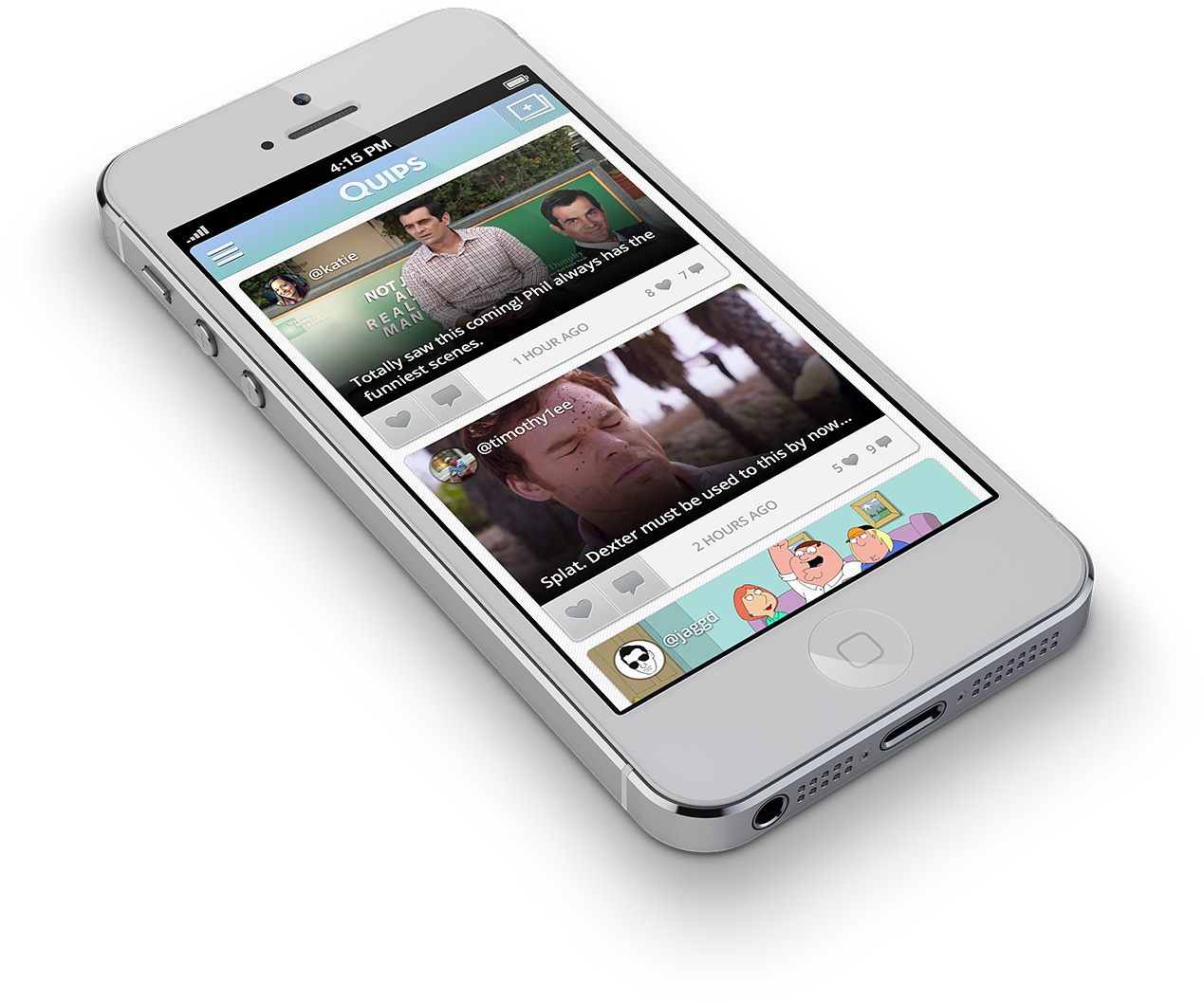
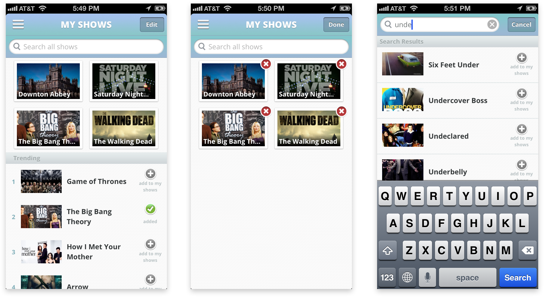
After several iterations on the visual mockups, I again compiled the screens into an interactive prototype. This prototype included some simple transitions and animations, but in the interest of speed, I withheld some of the more intricate interactions I had in mind. After locking down the mockups, I did some interaction prototyping, like this parallax effect which maintains focus on the pictured dish when scrolling through the details.


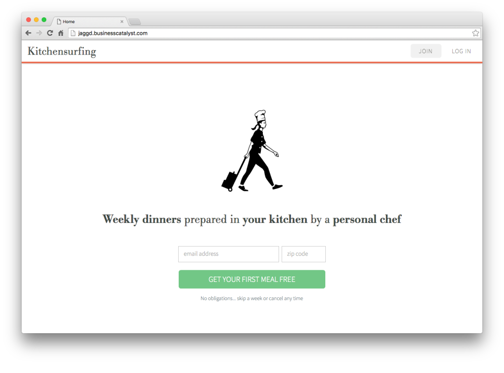
While designing a new mobile app for the subscription model transition, I took it upon myself to re-imagine our website as a side project. I had concerns that the website was doing a poor job of attracting prospective customers. The site was trying to say too much, too soon. It was long. It was busy. And as a result, it was alienating.

Since the goal of the landing page was to generate leads (people who provided an email address), I distilled the experience into three core pieces of information that customers had told me were most important to them.

  • What is Kitchensurfing's service?
  • What does the chef do? (Another way of asking, "What do I have to do?")
  • What can I have to eat? (By far the most important question, right?)

The prototype I created was a concept that turned the current site on its head. It stripped away all the noise and supplementary information and focused on those three high-level questions. I distilled the content into three components with a minimalist visual treatment: a hero with CTA, a triptych of informational illustrations, and a gallery of dinner menus. I readily admit that I may have over-simplified the content, but as a proof of concept, it accurately conveys my critique of the existing site. Explore the site prototype.

conceptShot


May 18, 2014Comments are off for this post.

Thirty Labs

After Telecast shifted gears and relaunched, the engineers and I worked on a series of alpha projects. The alphas are short product experiments (or prototypes, if you will) focused on consumer internet video consumption in some form. Over the course of 2 - 3 weeks, we identified an opportunity, established a hypothesis, built a polished prototype, and tested the concept with a small group. Given the absence of any business constraints, we were free to work on the ideas that most excited us and take them in any direction.


Airwaves

People share videos in a variety of ways, in casual conversation, via email/messaging, on social networks, and on websites. It's a form of self-expression, but limited in scope given the existing channels. Would people get excited about a dedicated video sharing platform with elements of serendipity and anonymity? Airwaves is a mobile video sharing experience modeled after Tinder, where people choose one video to share, and then see snippets of nearby people's videos. If they like them, they can watch the whole thing. If not, they skip to the next person.


flow_sketch

appIcon_render
iOS_onboard_avatar iOS_onboard_video iOS_onboard_casting_anim(cut) iOS_watch
Crumbles

For almost as long a video has existed, video creators have repurposed found footage in entirely new contexts. There is something intriguing about creating something new by simply placing existing content in a new format. For example, people chop up clips from movies to create a trailer that completely alters the story and genre of the original film. I was inspired by this video of Barack Obama "singing" Call Me Maybe. It probably took the creator countless hours of searching speech transcripts, cutting video clips, and editing. But if all the creator has to think of is what to make Obama say, then anyone can do that. And we can automate the rest.

crumbles_mock2


Hyphy

With cable television become an increasingly unattractive product, people are turning to streaming services for TV entertainment. However, we often end up with an array of devices and services that effectively do the same thing (display movies and shows on our living room screens) but host entirely different catalogs of content. This forces us to discover and remember a specific pathway to access a specific piece of media (e.g. If I want to watch House of Cards, I have to remember that I need to go through Netflix, and then recall which of my devices is set up for Netflix access.) All you should have to do is decide what to watch. Hyphy addresses this by enabling one-tap access to TV shows. The idea is that a universal remote control can remember where a given show is, turn on all the necessary components, and navigate to it. So there's no fussing with multiple remotes or searching through menus. Our prototype was a mobile app and infrared blaster that was able to automatically play a short list of shows via Netflix on Apple TV, and then control playback.


hyphy_sketch

iOS_splash  iOS_homescreen  iOS_searchingHome  loader_anim_mock  iOS_playing
Video Breakfast

In doing my casual ethnographic research (by which I mean randomly asking people about when/why/how they watch video, and observing people's video habits) I noticed a common thread: passive viewing. Essentially, passive viewing is using video to supplement other activities. For example, turning on the TV while cooking dinner or getting ready in the morning. While I couldn't think of any internet products or content that were specifically targeting this behavior, the television morning show typifies this experience. Morning shows have tremendous viewership, yet of all the people tuned in, are most of them giving the show their full attention? Not likely. So we set about creating a morning show for the cable cutters.

Video Breakfast is an alarm clock of sorts. People use a mobile app to set the time when they wake up in the morning, at which time a daily curated show is sent straight to their televisions (via Chromecast in our prototype.)

flow_sketch flow_sketch2
iOS_AppLanding_anim iOS_setAlarm iOS_Countdown iOS_nowPlaying
TVdisplay

May 16, 2014Comments are off for this post.

Homeslice

As Telecast was winding down, the engineers and I decided to work on a side project. We'd been using animated GIFs in our products, as were our friends at Giphy, and almost every other company in the Betaworks office. But GIF creation is a cumbersome process. Most of the existing tools are inefficient, imprecise, and not geared toward casual usage. Perusing GIF tutorials on the web, Photoshop seems to be the standard recommended application. Photoshop, really?!

So we set out to build Homeslice, a GIF creation tool that strips away the technical complexity. Further, since the casual creator is going to want to use existing web video content and not their own original videos, we designed Homeslice to function as a YouTube (or Vimeo) plug-in of sorts (it's actually a Chrome browser extension.) So people never have to deal with importing video files.

homeslice_mac

There's not much to see in the screenshot, and that's the point. Most of the features and controls of existing GIF-creation tools aren't conceptually accessible. Most people know anything about dithering, frame delay, or lossy compression. Nor should they have to. All they really care about is choosing a slice of a video, so that's what Homeslice focuses on.

Because our officemates were using Homeslice so much, and wanted to customize it for some of their partners, we made the code open source.

Install the extension from the Chrome Store to start GIFing in seconds.

May 10, 2014Comments are off for this post.

Telecast

Prior to my arrival, Telecast was a video discovery mobile app borne out of the Hacker-In-Residence program at Betaworks. I joined when the company (of 2 people at the time) was initiating a pivot. YouTube has enabled people to make online video creation into a business, but doing so is a hack of sorts. YouTube is better suited to viral video than sustained creator/viewer relationships. Even when it works, YouTube forces creators to spend an unnecessary amount of time managing their channel, instead of focusing on content creation, only to withhold a sizable portion of revenue. Telecast set out to change this, by creating a platform optimized for fostering the creator/viewer relationship, automating channel management, and providing more ways to boost earnings.

After releasing the first version of the new Telecast, we began exploring features that would increase fan engagement, and provide creators with more insight into what aspects of their videos were really resonating with fans. A system for allowing fans to react to the video seemed like an easily understandable feature to implement, but as anyone who has scrolled through YouTube comments can attest to, something about their forum brings out the worst in people. YouTube comment sections are filled with people mocking the content, each other, and ultimately detracting from the product experience. How could Telecast provide fans with a means of expressing themselves, while ensuring that content is supportive and creating a sense of community?

Telecast's "Moments"  feature was an exploration of that question. Similar to Soundcloud's commenting system, Moments gives reactions context by pinning them to a specific time in the video. Driven by team feedback, early sketches focused on providing a variety of canned reactions.


moments_sketch1  moments_sketch2  moments_sketch3  moments_sketch5


But I quickly realized that this direction was leaping too far ahead. If we were trying to test the hypothesis of whether reactions and comments would increase engagement and community, why introduce all this complexity? All we need is one reaction, specifically one of appreciation.


moments_wires

This direction also had the advantage of making "liking" a moment a prerequisite to adding a comment. By framing comments as a complement to likes, we subtly suggest what the intended content of comments should be. I did several iterations on all of the interactions and visual design, but it was difficult to picture the experience from static images. So I built a couple interactive prototypes to test the direction I was considering. The lighter, more passive experience I nicknamed Skim Milk and the heavier, more invasive experience I called Egg Nog. I recruited a few people via TaskRabbit to come in and test the prototypes, and Skim Milk was heavily favored among the participants and other people in the office. Only then, did I fully mock up the screens and establish the interaction details.


iOS_Moments_addComment2


momentsFlow3


May 30, 2013Comments are off for this post.

Pocket Mobile Activation


jesseP


The Pocket team brought me in to work on a problem they were seeing in their usage data: signups via their mobile apps were resulting in significantly lower retention rates than signups on desktop browsers. While this might seem counterintuitive given Pocket's emphasis on anytime-anywhere utility, there were still some unknown reasons for that statistic. Pocket wanted to uncover the hidden causes, and come up with a solution to boost their retention rate for mobile signups. So they had planned a series of design sprints in conjunction with the design partners at Google Ventures (one of Pocket's investors) and I joined the Pocket team as a dedicated in-house designer for the sprints.

Before we actually brought in the partners from Google Ventures, I wanted to better understand what we were up against. So I set up a quick study of Pocket's mobile apps (iPhone, iPad, and Android) by running a series of tests on Usertesting.com. I've used services like this as a fast, inexpensive, low-commitment method of getting feedback from people on a product or idea. In this case, I just wanted to watch some people engage with the app, hear what they had to say, and hopefully identify some of the issues in the new user experience. Here's a clip from one of the sessions:


Within the first minute, I saw a woman struggling because she was trying out the add via email feature (which is one that many people gravitate towards because it seems the most familiar and straightforward.) The woman thought it wasn't working, but in fact she was simply getting thrown off by the short delay that is inherent in sending an email (as well as the need to refresh her list.) Clearly, this was only a small piece of the larger problem, but these tests helped surface usability issues that were previously unknown.

With insights from the tests in mind, we kicked off the sprints by putting up a wall full of "How Might We..." statements on Post-It notes...

2013-02-20 13.38.22

... and identified which problems were most critical to address over the course of the sprints (by voting with the dot stickers.) Using one or more of the selected statements, we began sketching solutions. I use the term 'solutions' loosely. We weren't coming up with flows or UIs yet, we were coming up with phrases and doodles that propose an experience. For example, pre-populate Pocket with sample content so people's first contact with the product is not an empty list.

Another round of voting gave us a set of stories to tell with some rapid storyboarding. We're still not thinking about how these solutions might actually work in the product, but we have begun articulating how a series of events or experiences can address the problems we're tackling.


storyboards


Yet another round of voting brings us to prototyping! Each team member took a story concept and brought it to life in a simple Keynote prototype. Now we're trying to piece together an actual flow, although we're doing so in a vacuum, not in the context of Pocket. After a few rounds of critique to get all the prototypes into a realistic, usable state, we're ready to start testing.

I won't go into the intricacies of running live user testing sessions with multiple prototypes, but we certainly didn't lack for feedback after the first round. From this stage, each consecutive week-long sprint involved refining the prototypes using the insights generated from the prior week's study and testing them again until we had a single prototype that combines the best aspects of the prototypes to date, addresses all the important problems, and encapsulates the experience we want people to have. I built this final prototype in the Pocket style, so we could transition seamlessly from prototype to working product in user testing. Here are a few screens from the prototype (aside from the illustrations, this was all done in Keynote):


PocketProto


Drawing on the findings from the final round of testing with this prototype, we started to design a new onboarding flow and new user experience for the product. There were still some open questions not fully validated by the testing, but testing never ends, so rather than guessing at the best solution, we set up a few A/B tests in the new product.

An article about this specific project mentions the 60% conversion uptick generated by the new designs. It's always exciting to see tangible results from design work.

You can check out Pocket for yourself on the web, iPhone, iPad, and Android.

May 17, 2013Comments are off for this post.

Quips


quips_Phone2When I joined Miso in the fall of 2012, the company had recently pivoted away from their old product (also called Miso.) The old product is a second-screen social TV application that supplies an enhanced while-you-watch experience, but it had seen very slow growth over the previous couple years. Their new concept, Quips, is still a social TV product, but one that isn't tied to TV-watching. I describe Quips as "Instagram for TV", other people have called it a "TV meme maker."

Although Miso had employed a handful of designers over the years, I became the team's only designer shortly after I joined. When it came to product, I did everything short of coding. This included prototyping, interaction design, user research, usability testing, UI design, marketing graphics production, and even some video production. (I had the help of a contract visual designer who helped kick off the branding and product look in the first couple weeks.)

I'll walk through one of the design challenges I faced early on as an example of my process. One of the critical aspects of the product is ensuring people see content that interests them. If you don't watch The Bachelorette, chances are pretty good that you aren't interested in content from that TV show.

I always begin by trying to understand the problem I'm trying to solve before I go about solving it. So I busted out the good ol' Post-It notes, and channeled potential users of the product by writing "I want to..." statements in their voices. For example...

"I want to have a way to only see stuff related to the shows I watch."

But also...

"I want to see what my friends are talking about, even if it's not a show I watch."

I wrote down as many as I cold think of, trying to stretch my imagination to the unlikeliest scenarios in order to reach the full spectrum of use cases. First things first, how can we solve for the first "I want to..." The approach I ended up taking (and we did consider others) was to allow people to curate a list of shows.

From here, I sketched. Early sketches look something like this:


quipsSketch


Quick and dirty. Quantity over quality. This stage is about documenting ideas. I do this a lot. This is what my workspace looked like:


Design Wall


I tend to take every opportunity to gather feedback. Sometimes just from my team, sometimes from designer friends, sometimes from actual users, and sometimes from totally random people. After incorporating any feedback I've received, it's onto figuring out how all the bits and pieces work.


quipsWires


I might do a low-fidelity prototype at this stage, or do testing later in the context of the app as a whole. But in either case, eventually I have the task of making everything look good and injecting joyful details that make people smile.


QuipsScreens


And after the product is built, we have to help people understand how awesome it is. There are countless ways to do this, and we tried out a lot of them. But the product video is always a tried and true method, or at least worth putting a week's effort into while we were waiting for App Store approval.


A couple months after Quips launched, Miso was acquired by Dijit, which was a bittersweet ending to my time at the company. The acquisition proved that Miso had gained traction in a challenging space, but it also meant my team had to move on to new challenges. And unfortunately, Quips would no longer be updated or supported.

March 18, 2011Comments are off for this post.

HeartBreaker Interactive Wall


[In case there was any doubt, I never actually dated Britney Spears.]

The HeartBreaker Interactive Wall was conceived of in the context of domestic rituals, specifically the rituals associated with the termination of romantic relationships.  After coming up with a number of concepts that clumsily attempted to tackle the associated emotions head on, I shifted to a more lighthearted approach, which immediately felt more resonant and successful.  After a break-up, people frequently go through a rite of "cleansing" themselves of their former significant other by disposing of artifacts of the relationship.  People once had the option to burn, flush, crumple, tear up, or otherwise destroy photographs of their exes, but now that so many of our photographs only exist digitally, it's difficult to garner any satisfaction from disposing of them.  Dragging an icon to the trash bin on a computer desktop just isn't the same as watching a picture go up in flames.

In order to make the ritual of purging such photographs a more cathartic experience, I developed the HeartBreaker Interactive Wall.  In its initial deployment, the wall displays a photograph along with a menu of virtual objects that can be "thrown" at the pictured ex: paint, eggs, bombs, and rocks.  Any physical object can be thrown at the wall, and the animation associated with the selected virtual object displays where the real object strikes the wall.  [We used pillows and stuffed animals in the demo, but a lamp, spatula, or cell phone would work just as well.]  A satisfying splat, crack, boom, or shattering noise is played upon impact, providing  the user with the notion that they've somehow inflicted an imaginary bit of pain upon their ex.  In subsequent revisions, I intend to feature some visual feedback that the photograph itself has been damaged or destroyed, as well as a system for moving the photo files on the user's hard drive (if they so choose.)

Although the interaction was designed as a mechanism to assist with the cleansing of an ex, there are certainly other applications that would deliver the same feelings of satisfying catharsis.  Boss been nagging you?  Grab his photo from LinkedIn and lob eggs at his face.  Your downstairs neighbor won't turn down the stereo?  Stealthily snap a pic when he comes out to retrieve his mail and blast away with some virtual bombs.  [My classmates and instructors were having a little too much fun hurling whatever was handy at the wall.]

The interface makes use of an infrared camera and lighting, which circumvents the problems associated with object detection in front projection systems.  Because infrared light falls outside of the spectrum of visible wavelengths, the infrared camera doesn't "see" the digital projection on the wall, and instead recognizes objects which are illuminated by the infrared lights as they reach the wall.  I used tbeta computer vision software for object recognition, which is able to communicate information about detected objects via TUIO.  I coded the interaction in Processing, which receives the TUIO data, and responds with the various animations and sounds.

[This was a collaborative project with classmate Shuya April He, who created the animations.]


Back to top Arrow