Minibar truly embraces the "mobile-first" approach to building their product. Even though Minibar makes a substantial portion of their revenue from desktop orders, in sheer order volume, mobile dominates. So when they brought me on and tasked me with redesigning their mobile app from scratch, I knew there was a lot riding on the project. While their existing app was perfectly functional (on iOS at least, not so much on Android) they recognized an opportunity existed to dramatically improve the shopping experience. The existing app wasn't aging particularly well, and no longer aligned with the way people expect to shop online. People have come to expect a dynamic shopping experience that showcases new content and provides an engaging way to discover products (all while making product finding and check out quick and straightforward.) However, their app was static and linear. Here's what the product browsing pathway looked like:

The app provided a linear pathway with a static beginning, middle, and end, but it left no room for discovery and delight. Clearly, I had my work cut out for me.
As I typically do, I started off by gathering insights to help define the problems. I brought in a random assortment of people who weren't familiar with Minibar to talk about mobile shopping in a loosely moderated study. The intent was not to identify usability issues with the app (that would come later,) but rather to identify product opportunities. To be clear, I wasn't expecting people to come right out and tell me what's missing from the Minibar app, but rather to demonstrate how they shop on their phone, and show off the apps they find themselves returning to again and again. This feedback allowed us to define an experience the app should aspire to create.
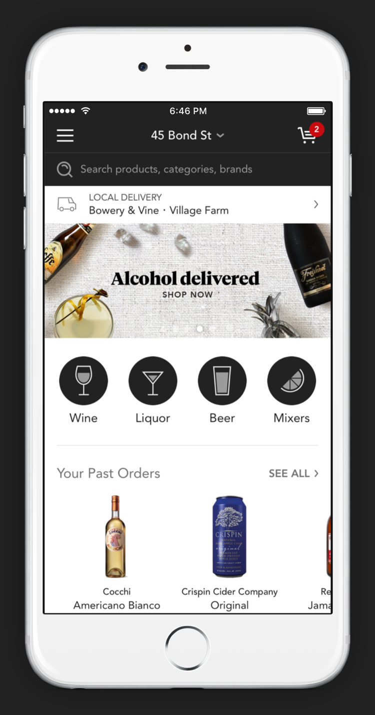
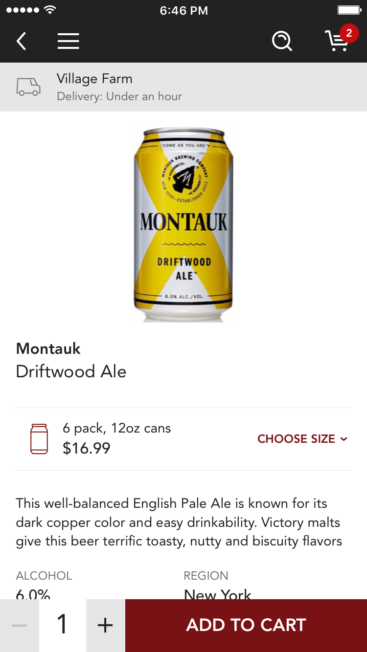
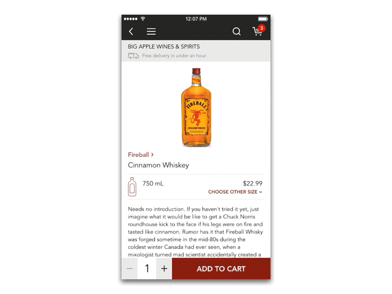
One of the most critical components of this aspirational picture is the homescreen. Putting aside the onboarding experience for the time being, this is the screen that people will see every time they start up the app. This is the screen they will see more often than any other screen. This is the hub from which they will navigate to all other areas of the app. This is the screen which they will show their friends who have never heard of Minibar. This is the moneymaker!
So it should come as no surprise that I spent a lot of time sketching homescreen designs. There were a lot of customer stories and business needs to account for (and a lot of internal stakeholders with strong opinions.)
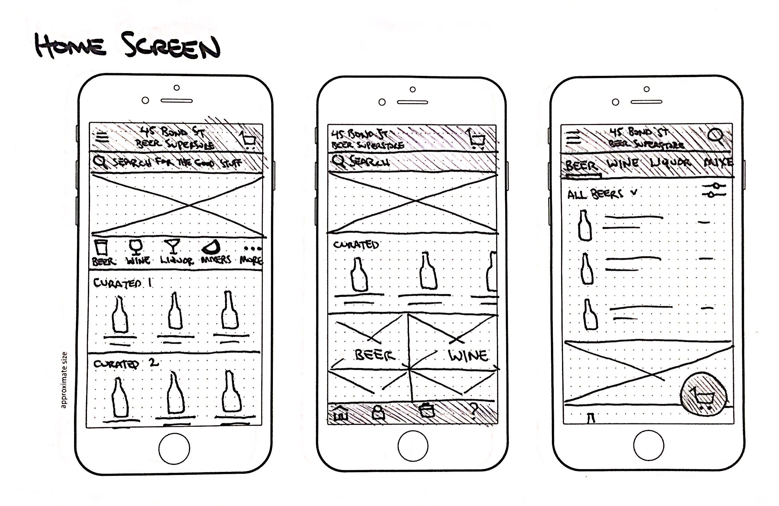
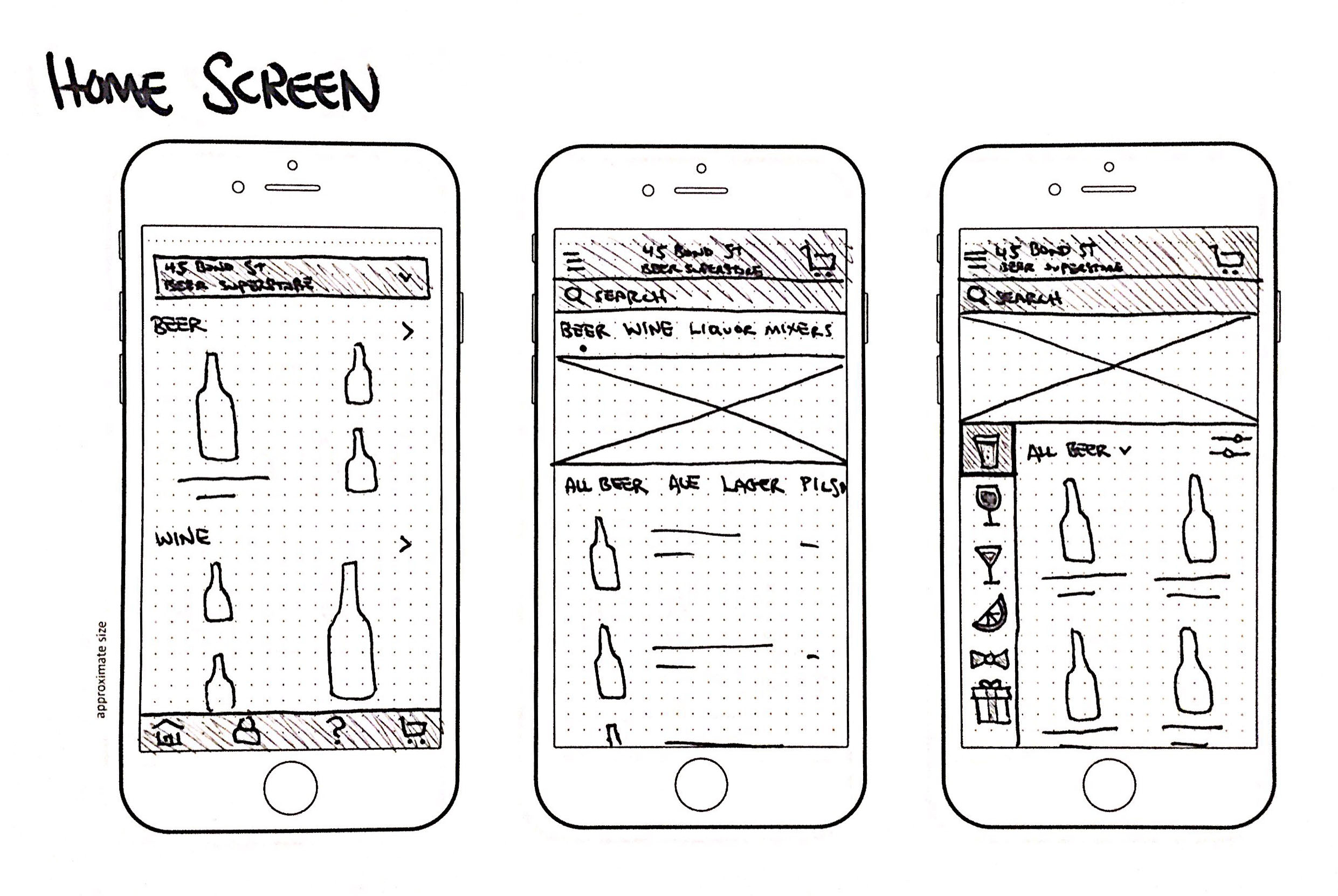
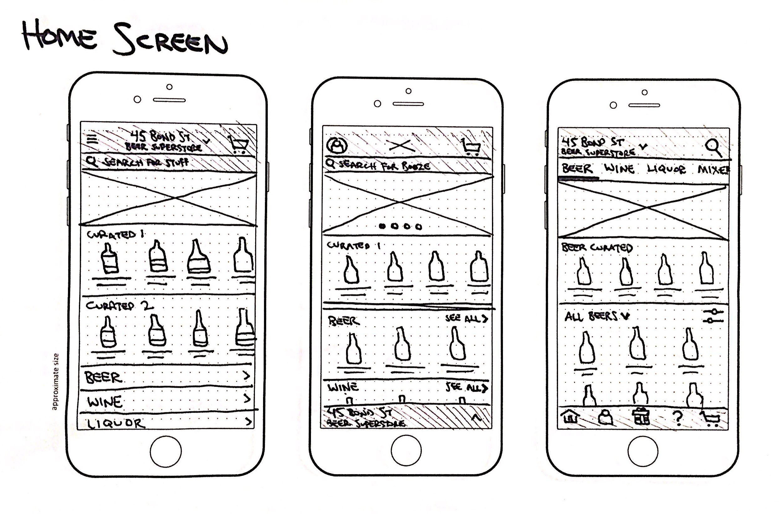
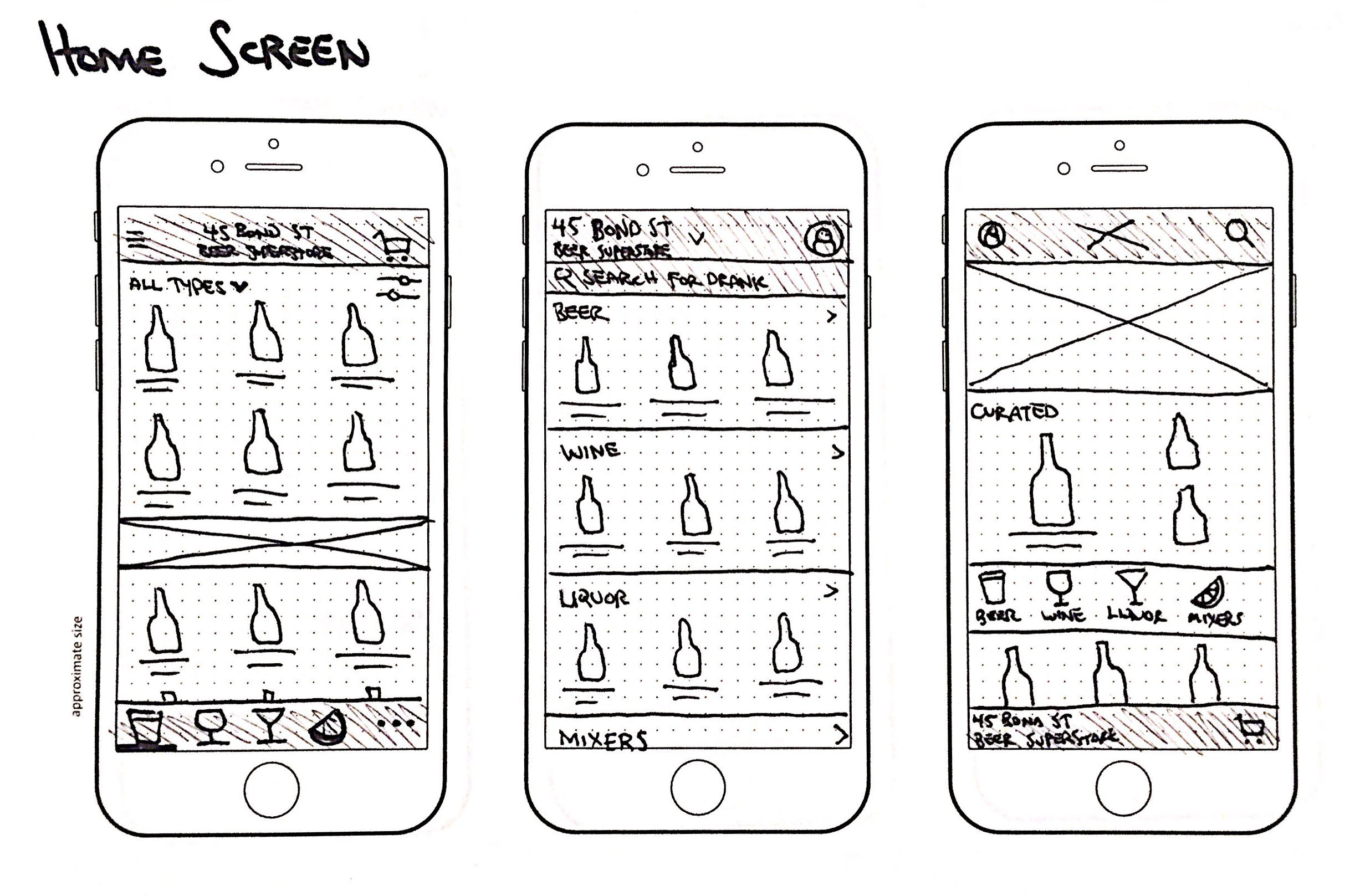
In order to maintain the clear product finding pathway of the existing app, while creating a dynamic space that allowed for discovery, I advocated for a modular platform. I defined a set of modules (e.g. banner carousels, product sliders, featured products, and brand placements) and coordinated with the engineering team to create a rudimentary CMS to power a prototype. That prototype eventually grew into the system that powers the homescreen today.
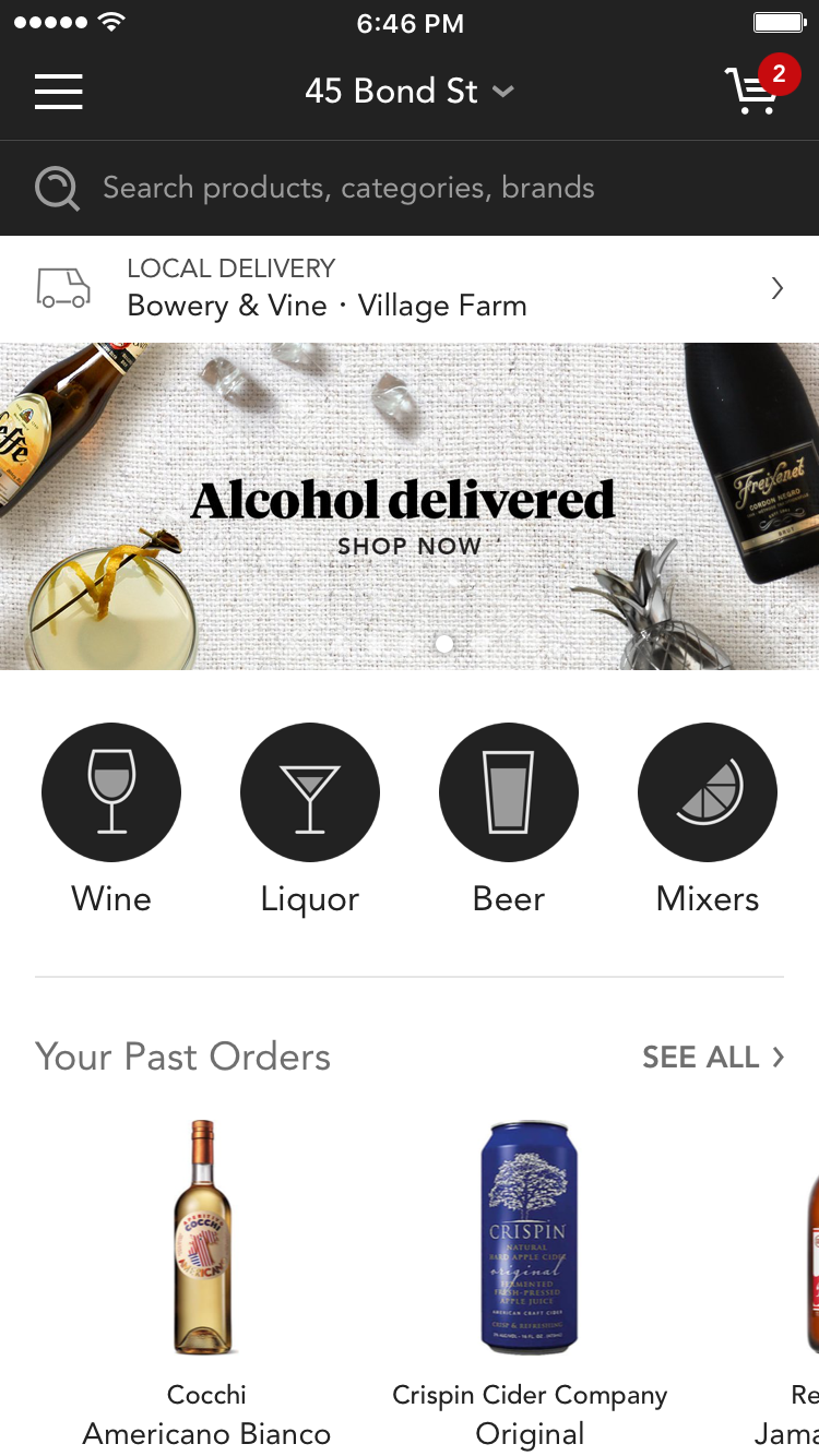
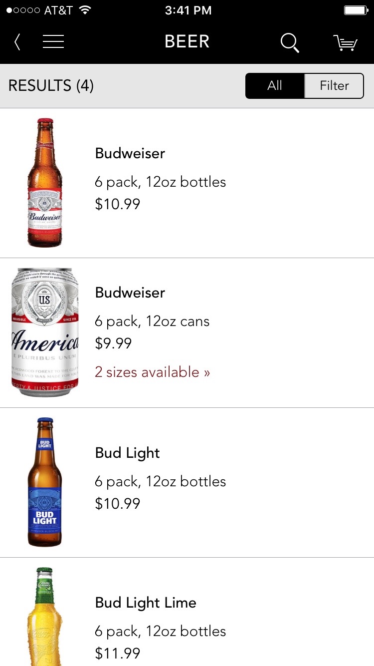
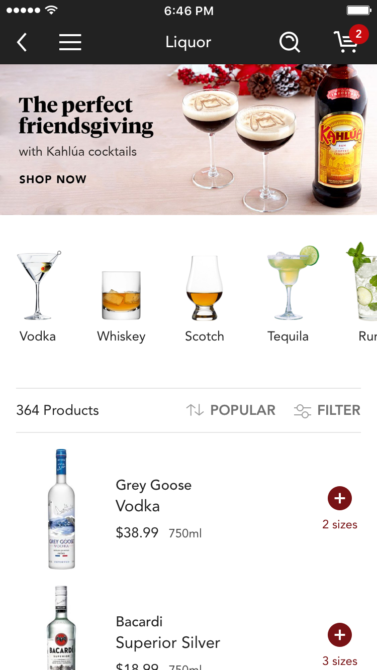
The dynamic content is controlled both systematically (by a recommendations algorithm) and manually (by our marketing team) all while controlling the inventory shown based on the customer's location (a story for another time.) Here are a few more screenshots:
And here's an example of an animation that alleviated an issue that arose in in usability testing.
The new app is built in React Native, which allowed us to use the same underlying system to power the app across iOS and Android. Some notable accomplishments of the new app include a 13% increase in dollars spent per order and a 9% increase in session conversion. This story only touches on a fraction of the process and work that went into designing an entirely new app for Minibar, I encourage you to explore the app for yourself on iOS or Android.

No comments.